OP
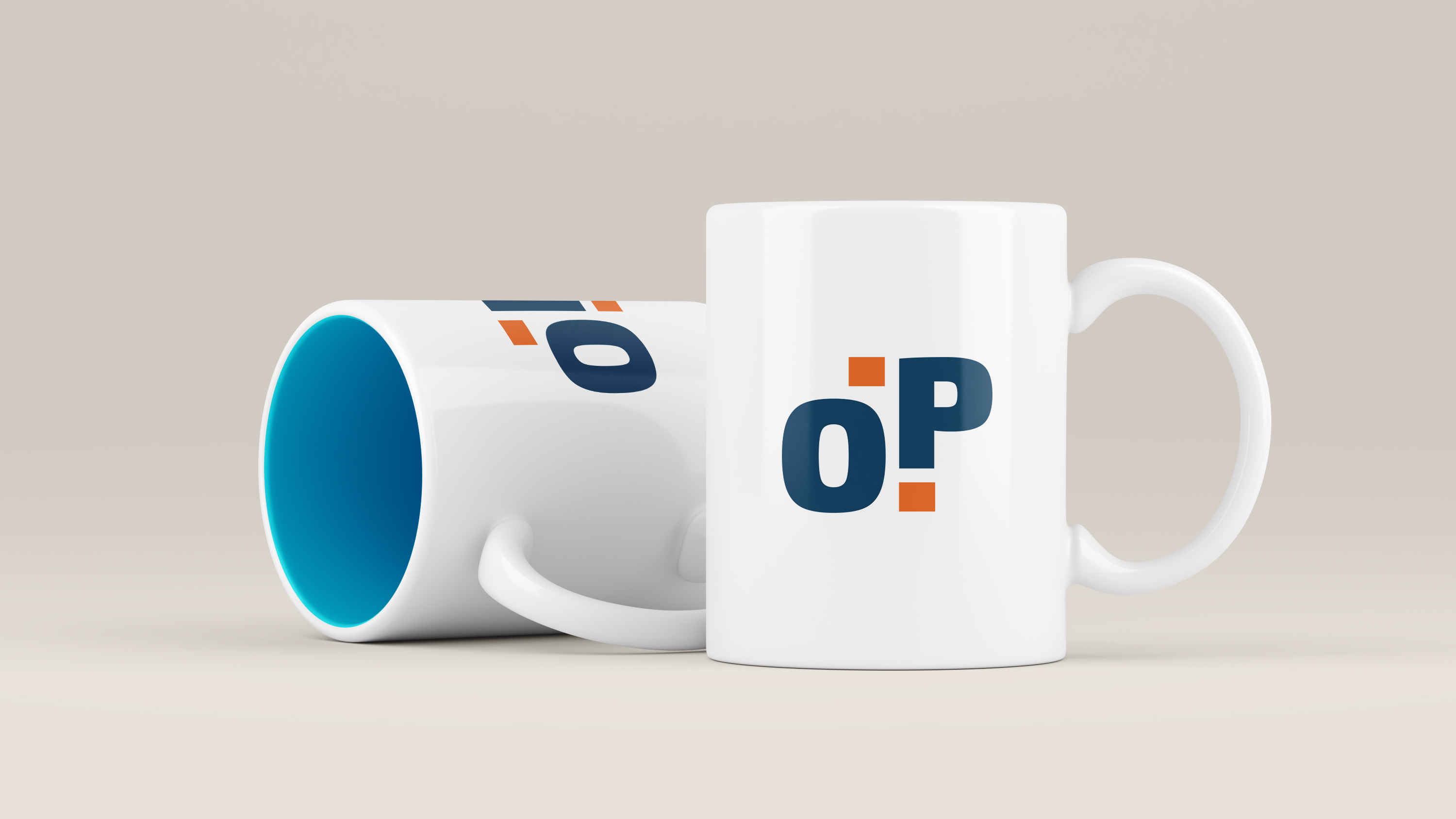
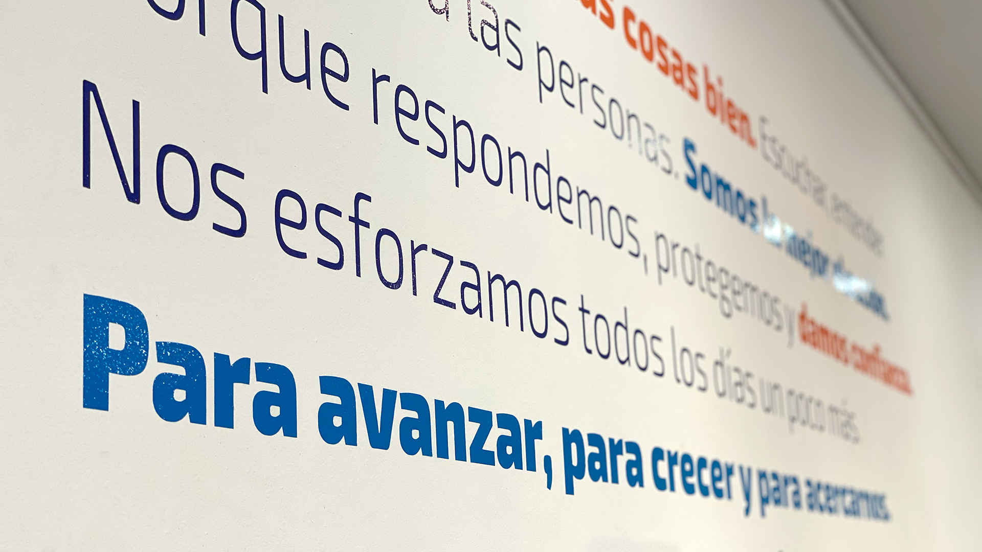
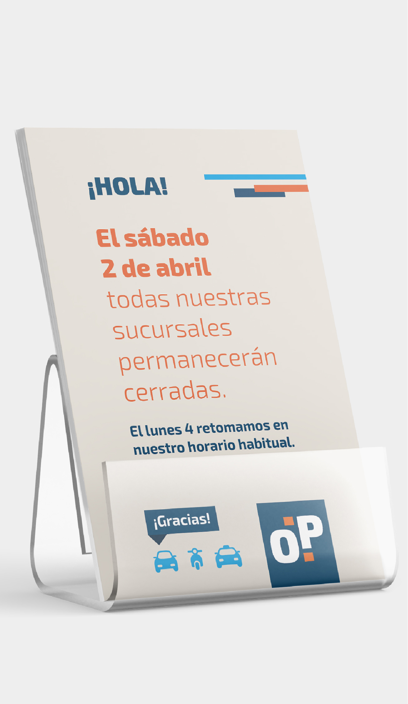
A company's identity based on human resources empathy is dissociated from its graphic brand. Although OP had strategic branches all over the city, was not fully visible. We designed a new corporate branding, which is friendly and, at the same time, asserts the company’s background. Connecting with brands, seeking solutions, enjoying the process, and in the end, getting a smile out of our clients is the ultimate goal of everything we do.
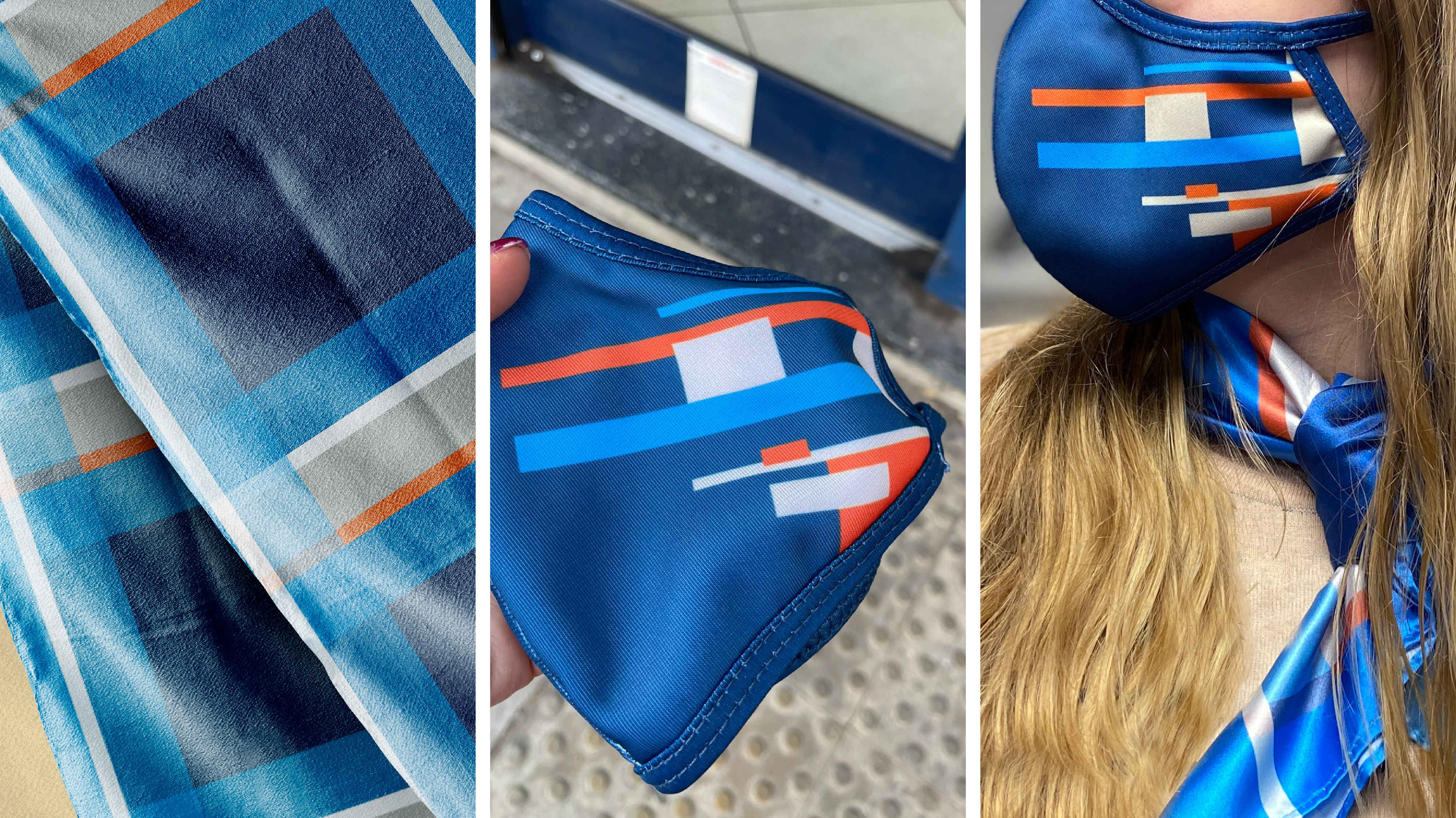
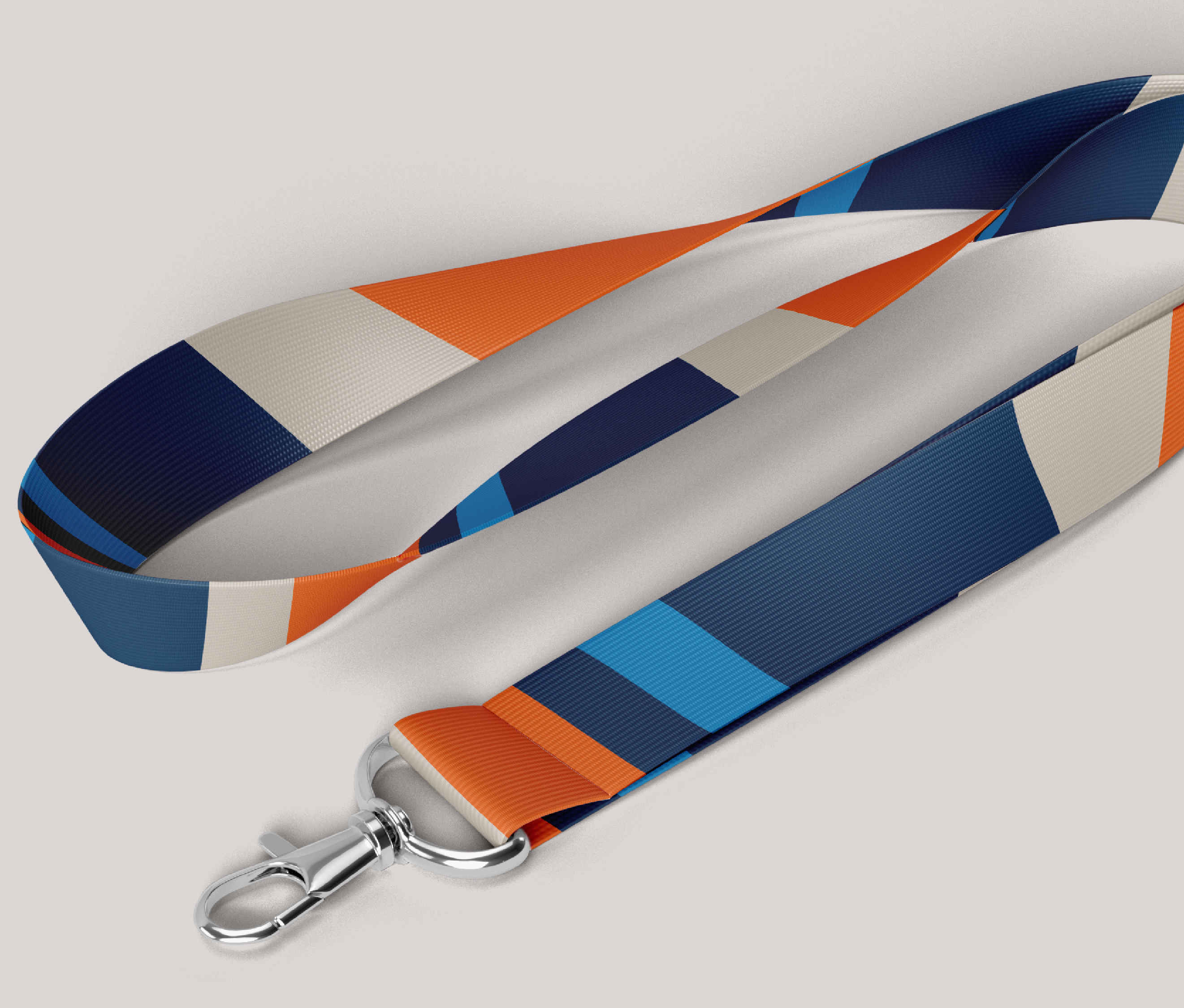
Colors - We keep the chromatic range using the original light blue.
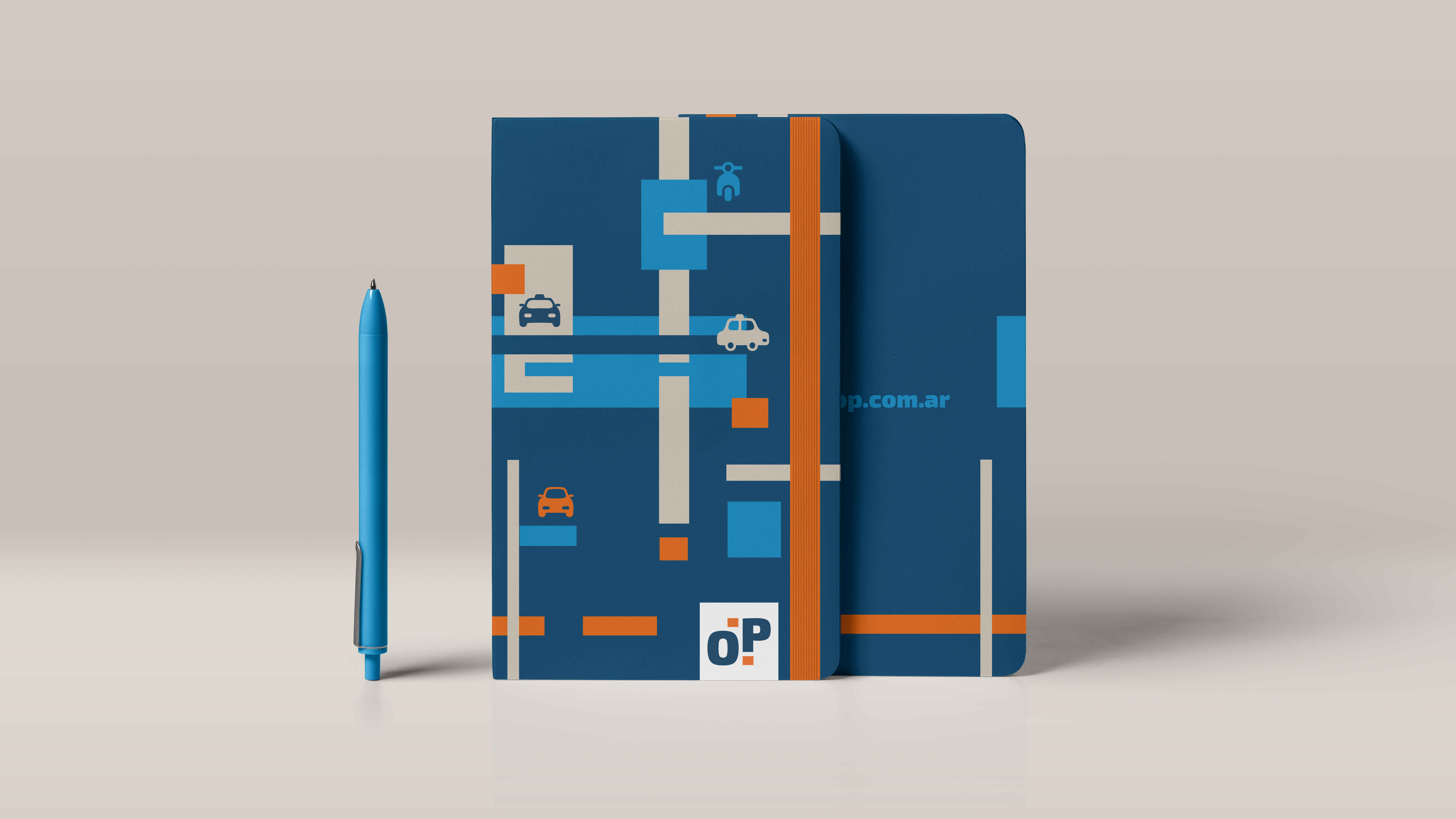
Patterns - We reflect urban transit through the graphics.
Movement - Motion graphics for social networks
Videos - Communication in stores.