Pan american energy
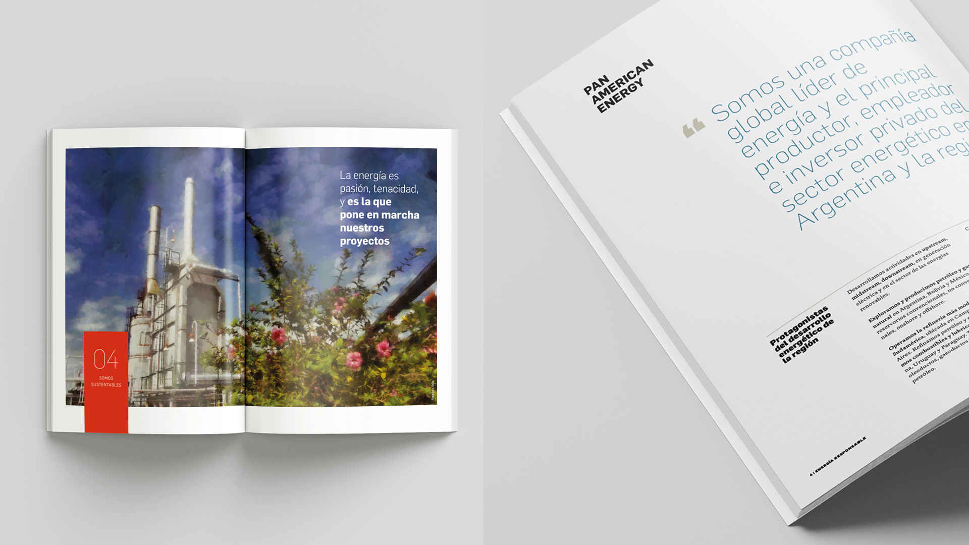
In 2016, we established the graphic standards to design the Pan American Energy institutional publishing. Since then, we have been working side by side with the client based on the same premise: to see the unseen details in each typographic setting or picture choice. Every single printed sheet of PAE motivates us. In the digital age, we go back to the printer because we understand that it is on the details where our distinction lies.
One of the decisions we made during the branding standardization was selecting Flama typeface by Felicianotype as the institutional family font for all company communications.
The institutional brochure is one of the most important editorial pieces for large companies. For that reason, we consider not only content design, but also photographic criteria and print production details of utmost importance in project improvement.
In 2020, during pandemic time, we had to address the need to work with previous photo shoots. That is when we came up with the idea of producing images that would bear a resemblance to watercolor paintings. The digital artist, Ivan Mansbach, was in charge of making them come true.

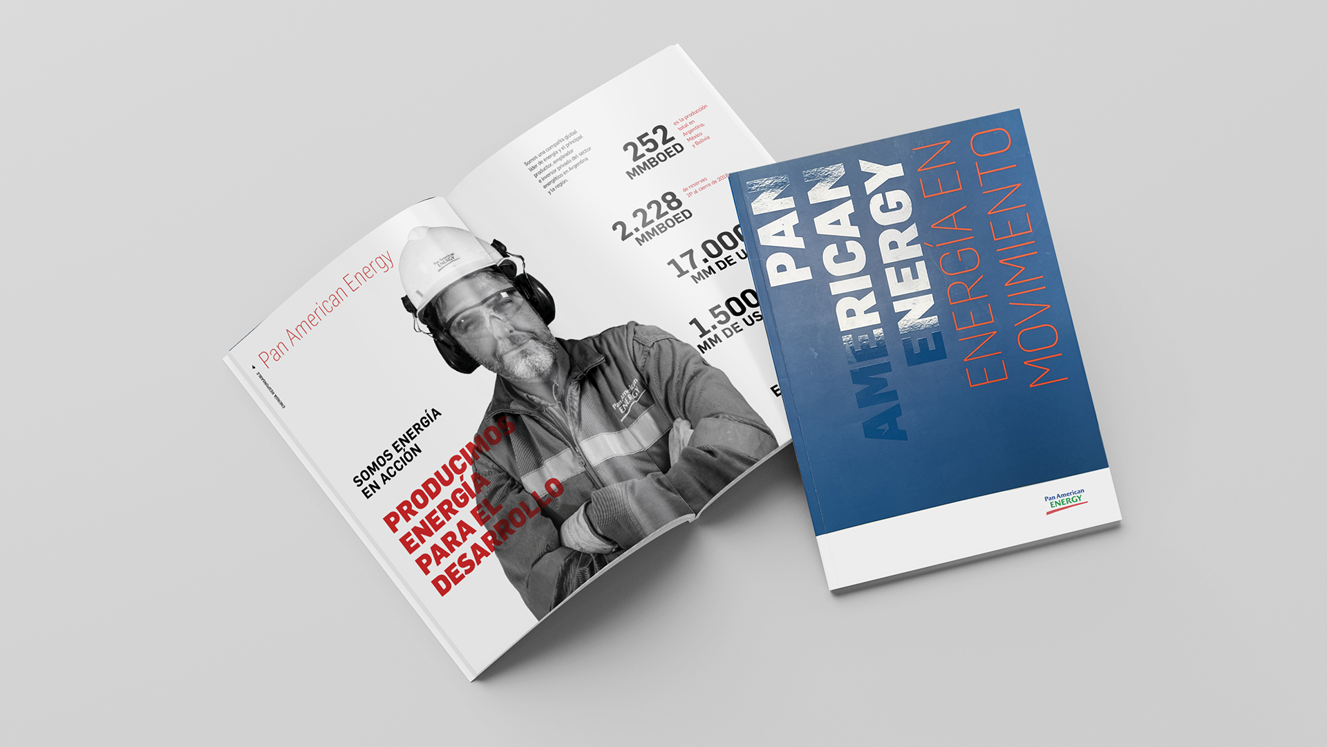
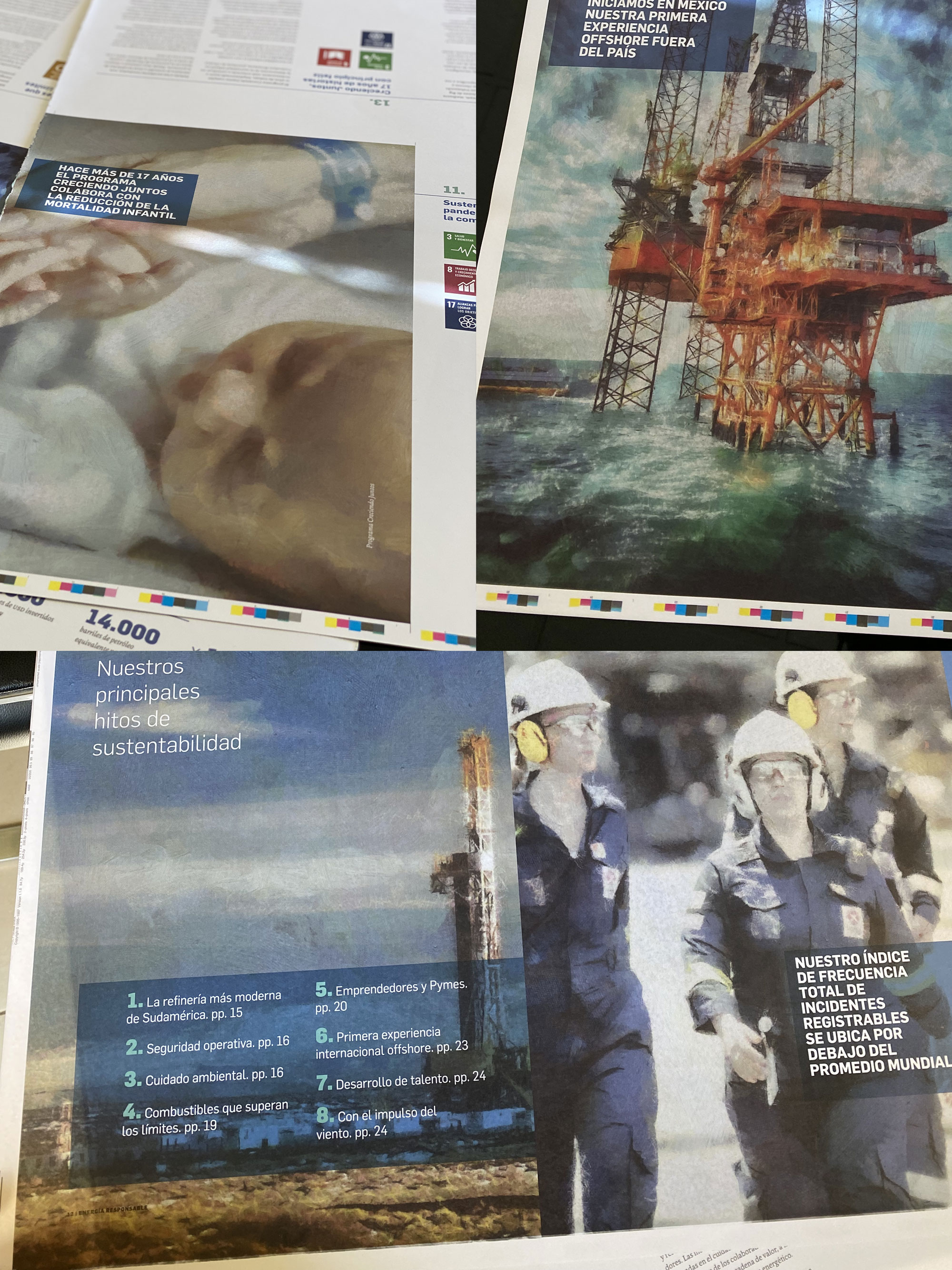
Press - Check print cuality of brochure 2020.

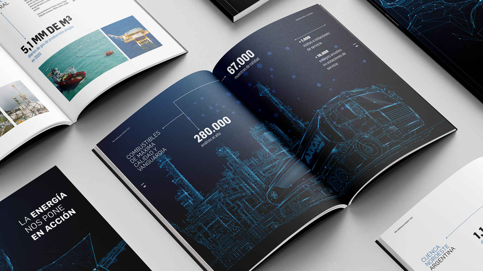
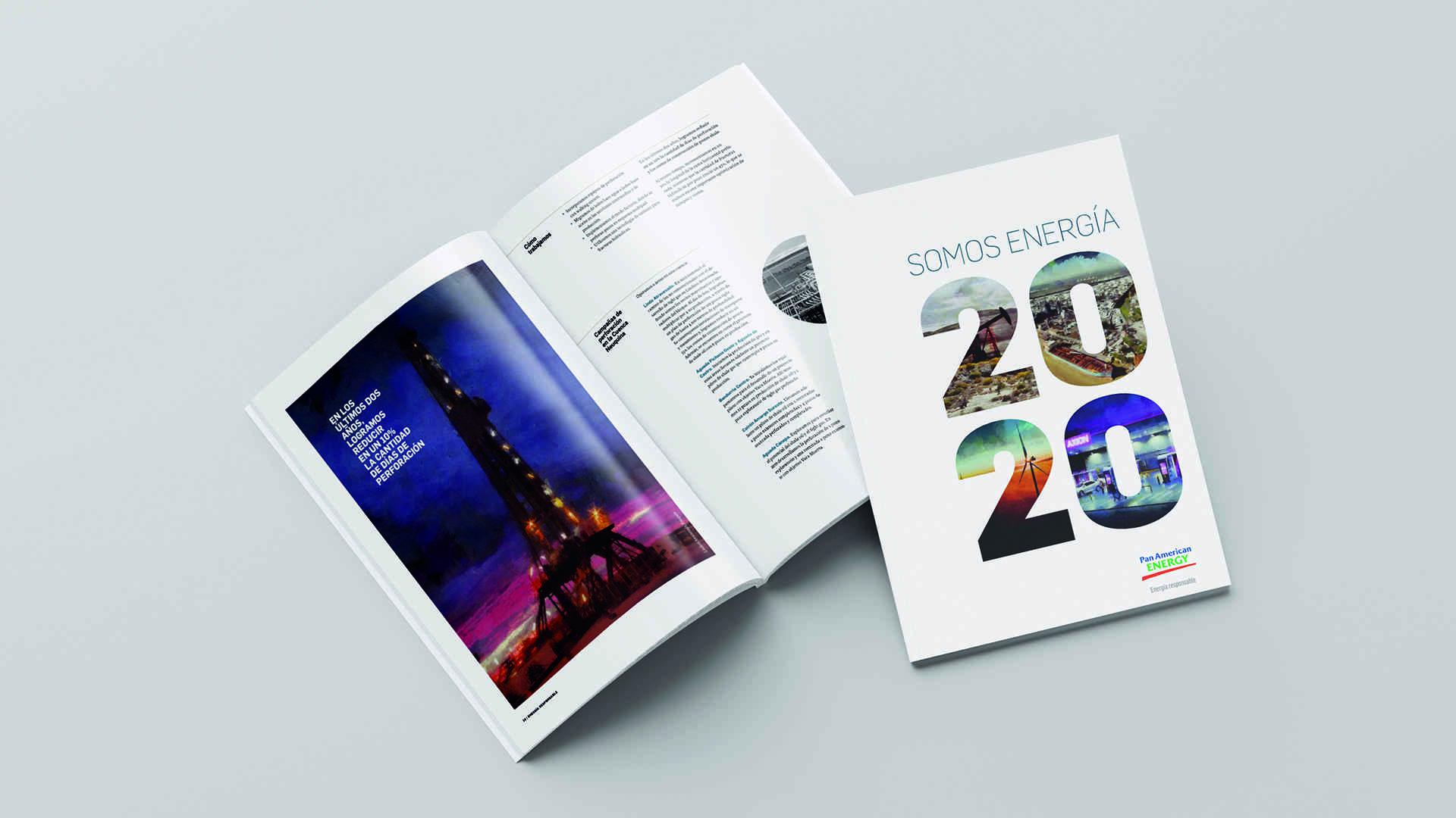
Ilustration - Brochure 2021 with illustrated neon images.

Every single printed sheet of PAE motivates us. In the digital age, we go back to the printer because we understand that it is on the details where our distinction lies.