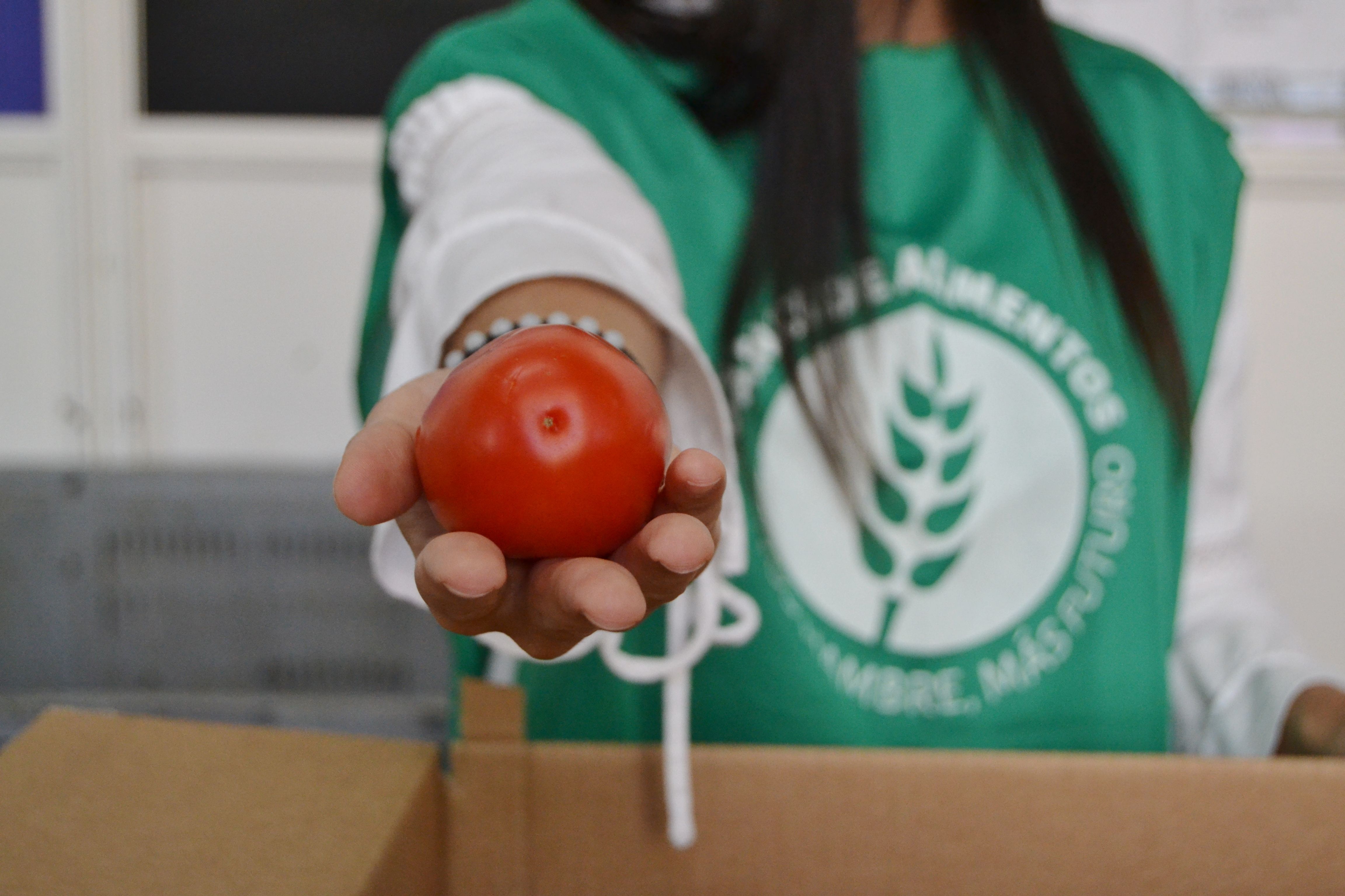
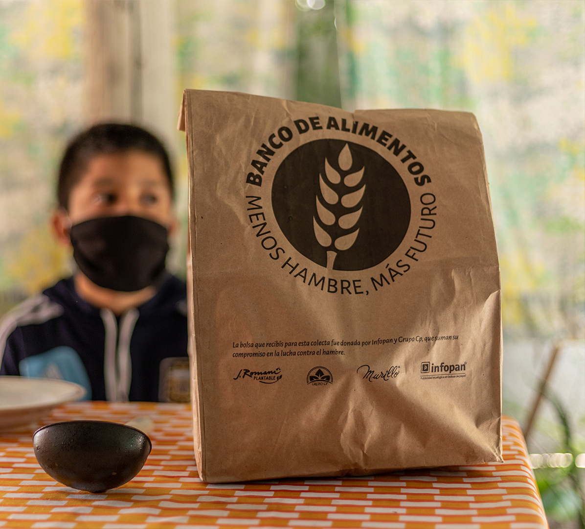
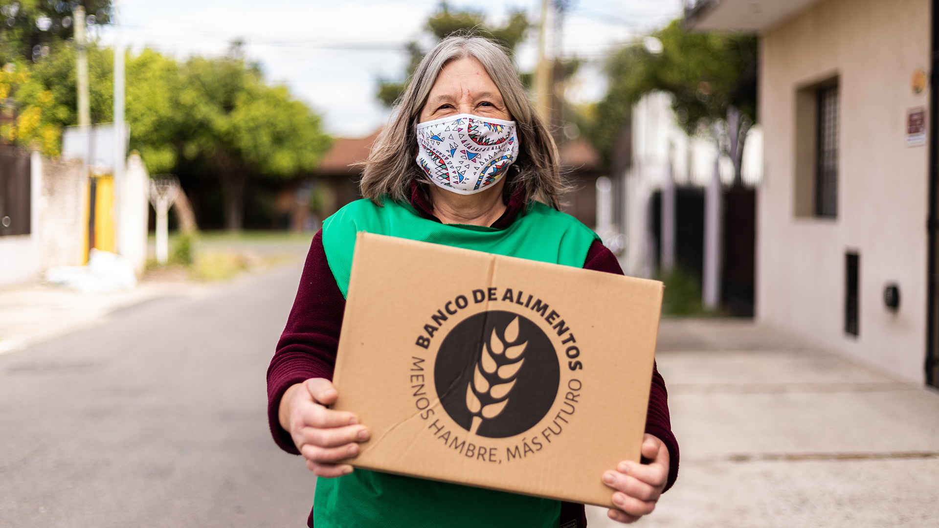
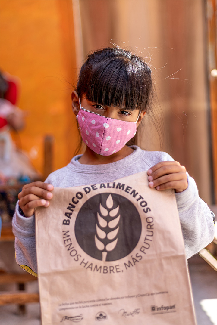
BANCO DE ALIMENTOS
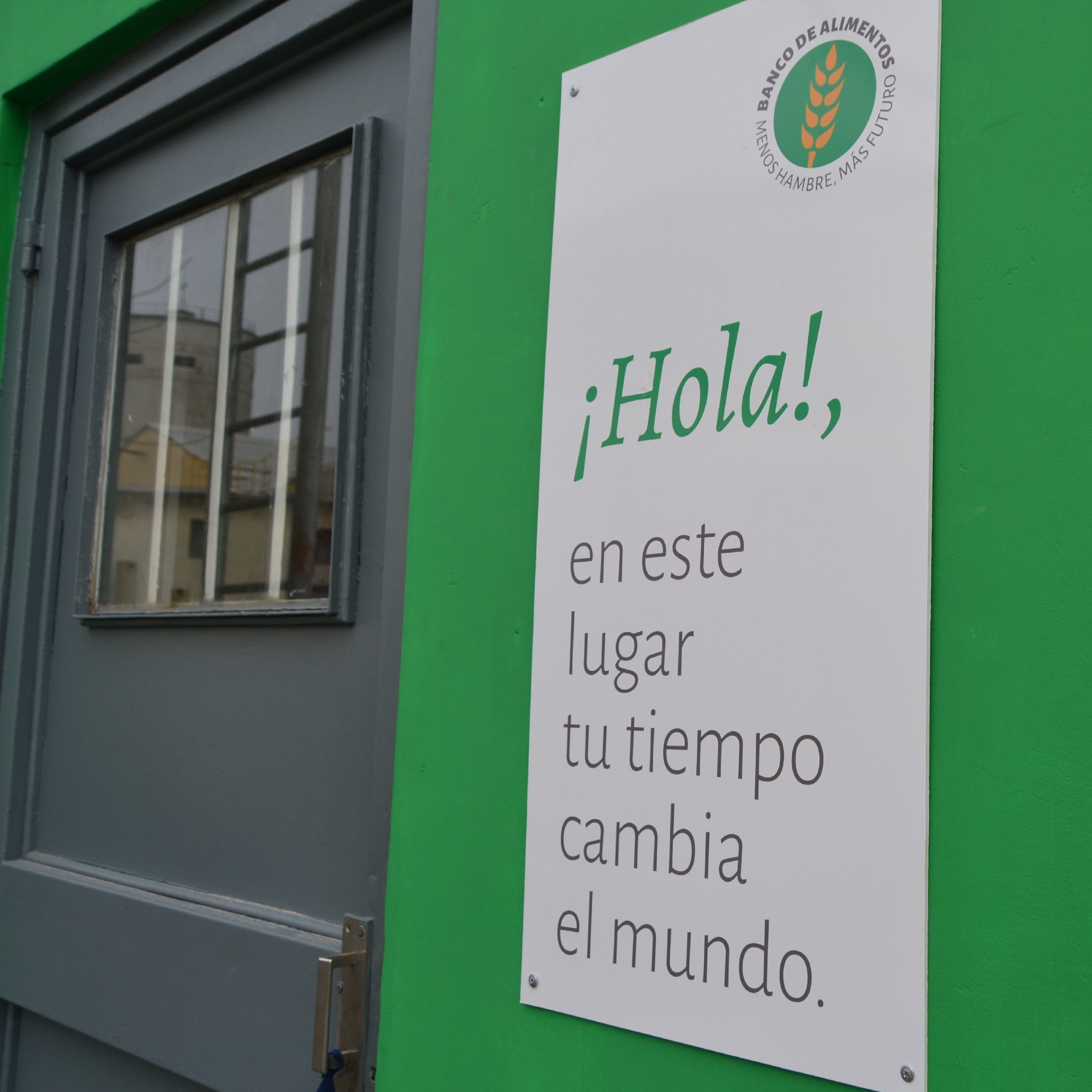
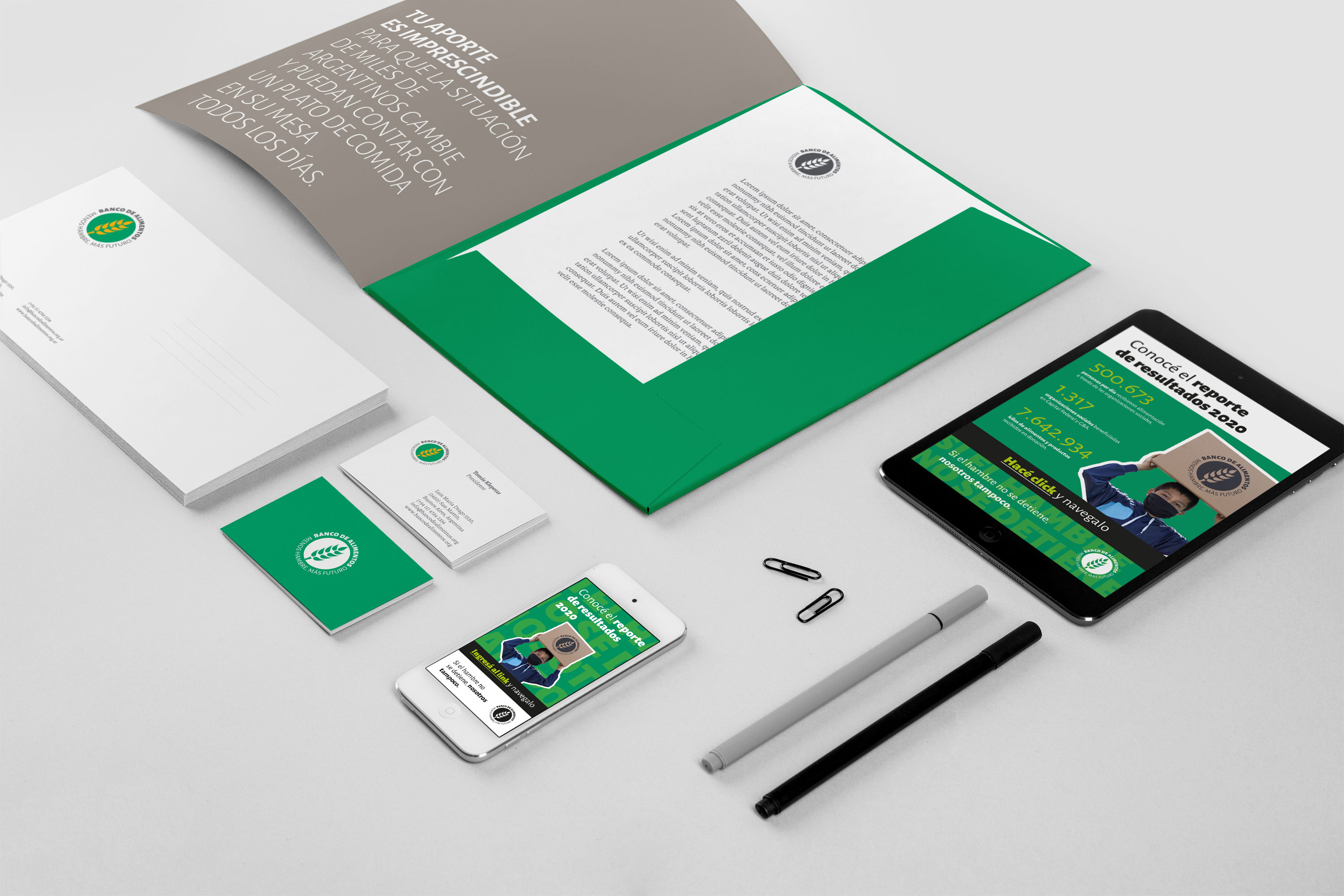
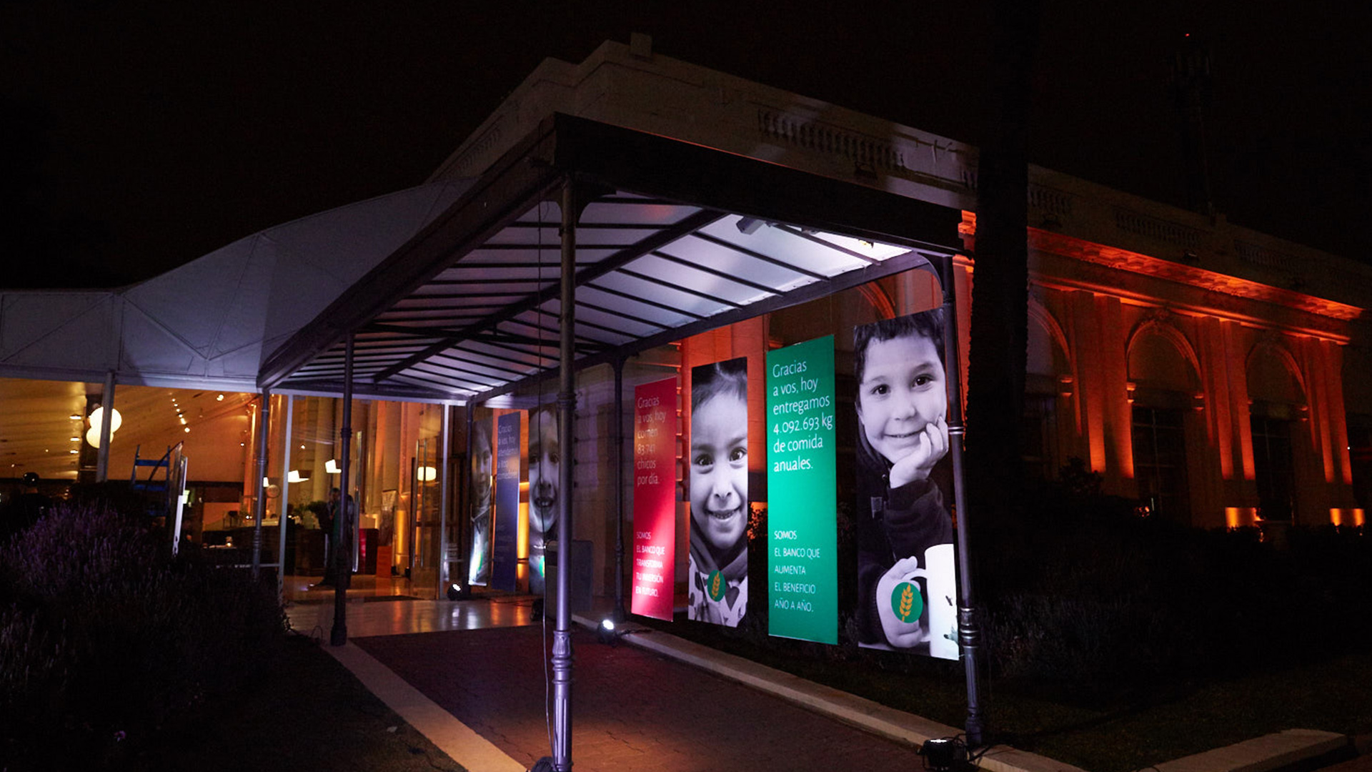
Redesigning a brand can be the goal or the starting point. With Buenos Aires Food Bank clients we work together as a team. We think about graphic solutions almost as an excuse to keep on working to achieve a bigger goal. We reflect on the company’s valuable effort to alleviate hunger with the aim of putting it into words to communicate its essence. That is our purpose for each graphic piece.
In the process of redesigning the Buenos Aires Food Bank brand, we picked up the essence from the former: a circular shape, an ear of wheat, and green and yellow colors. Every part was relevant to the World Food Bank brand universe, a «trademark asset» we wished to maintain.
We focused on the upper part of the spike: we made it longer to take up more space on the logo. We avoided yellow from overlapping on white by using a flat green circle that reassigns the idea of a group, a world, food, and continuity.
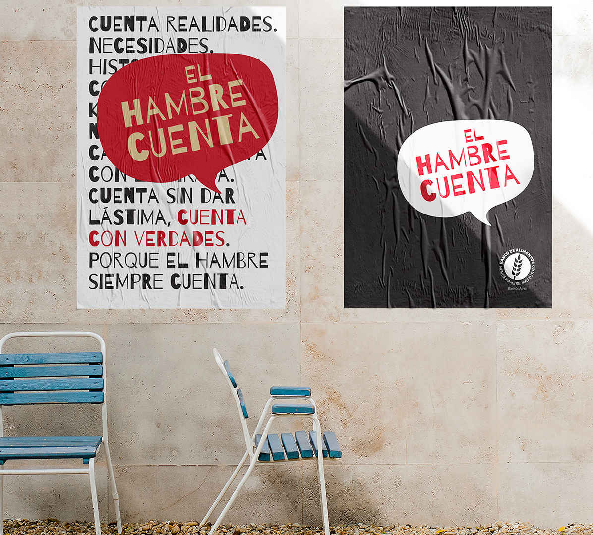
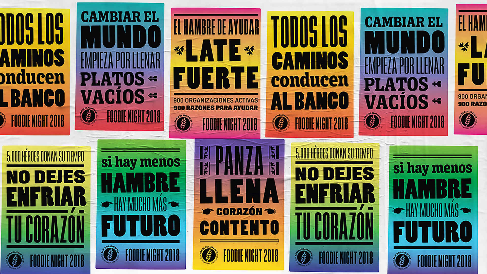
Finally, we included the slogan «Less Hunger More Future» with the intention of making the Food Bank mission an inseparable part of its brand symbol.

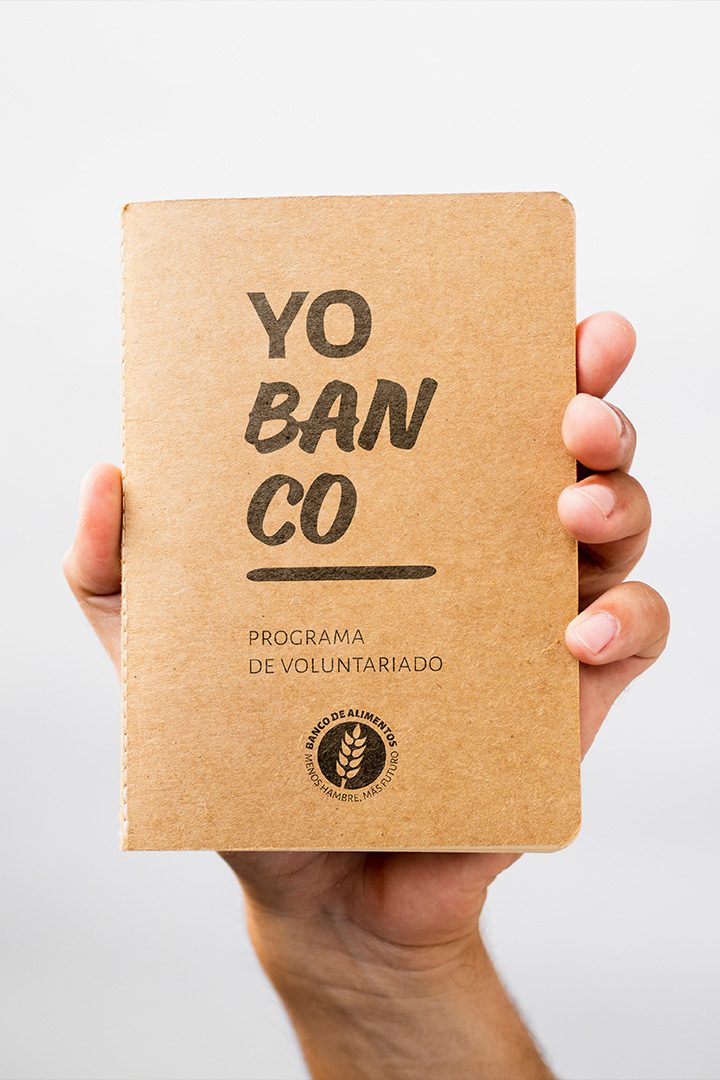
Type- We selected Juan Pablo del Peral's Alegreya family as an institutional typeface, in its sans and serif variants. 

teamwork
Volunteers are essential for this organization. Diverse individuals offer their time to collaborate with the Food Bank duties. It was important for internal teams to transmit that they held a prominent position within the organization structure. «Yo Banco» uses the Spanish word “banco” (lit. bank) in its sense «stand for» which conveys the idea of support to identify the Volunteer Program.
Every year, different events and fundraising campaigns are organized. We work with internal teams to define the concept and develop the specific graphical system for each event.
For year closure, we design the annual report that reports back to all donors (private and corporate) on the economic resources used, the tons of food distributed as well as the organizations involved, and their locations, among other things. We design the annual report between the months of January and February each year. It works as a turning point: it contains information from the previous year and defines the graphic elements for the following.

Capital campaign - Video presentation