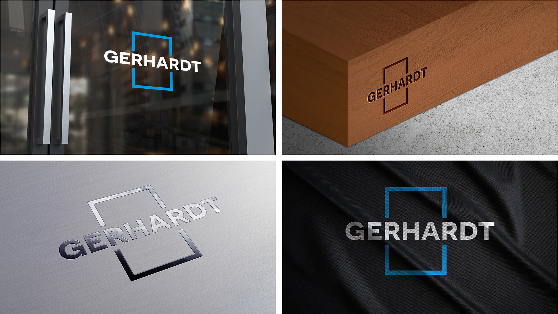
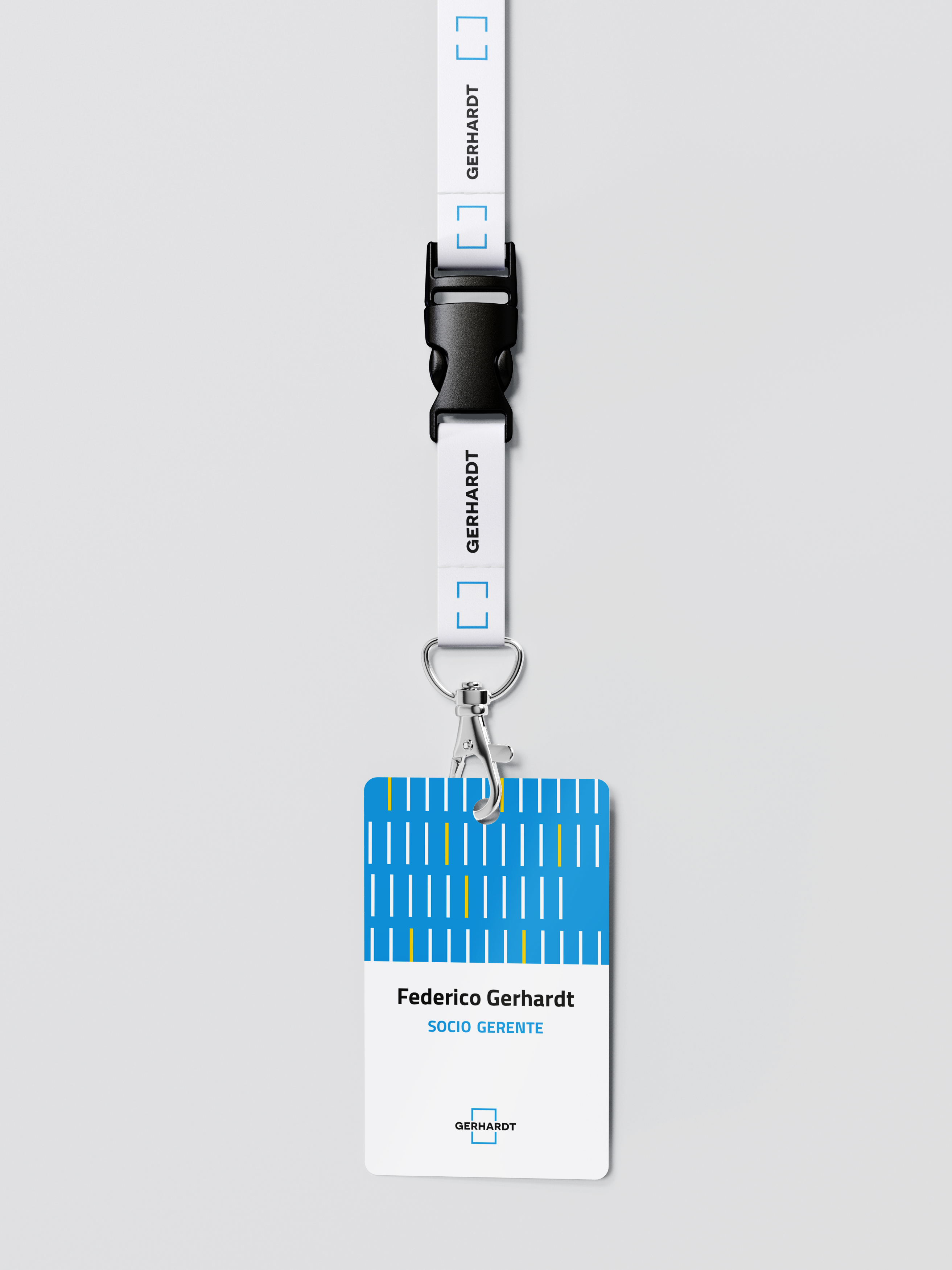
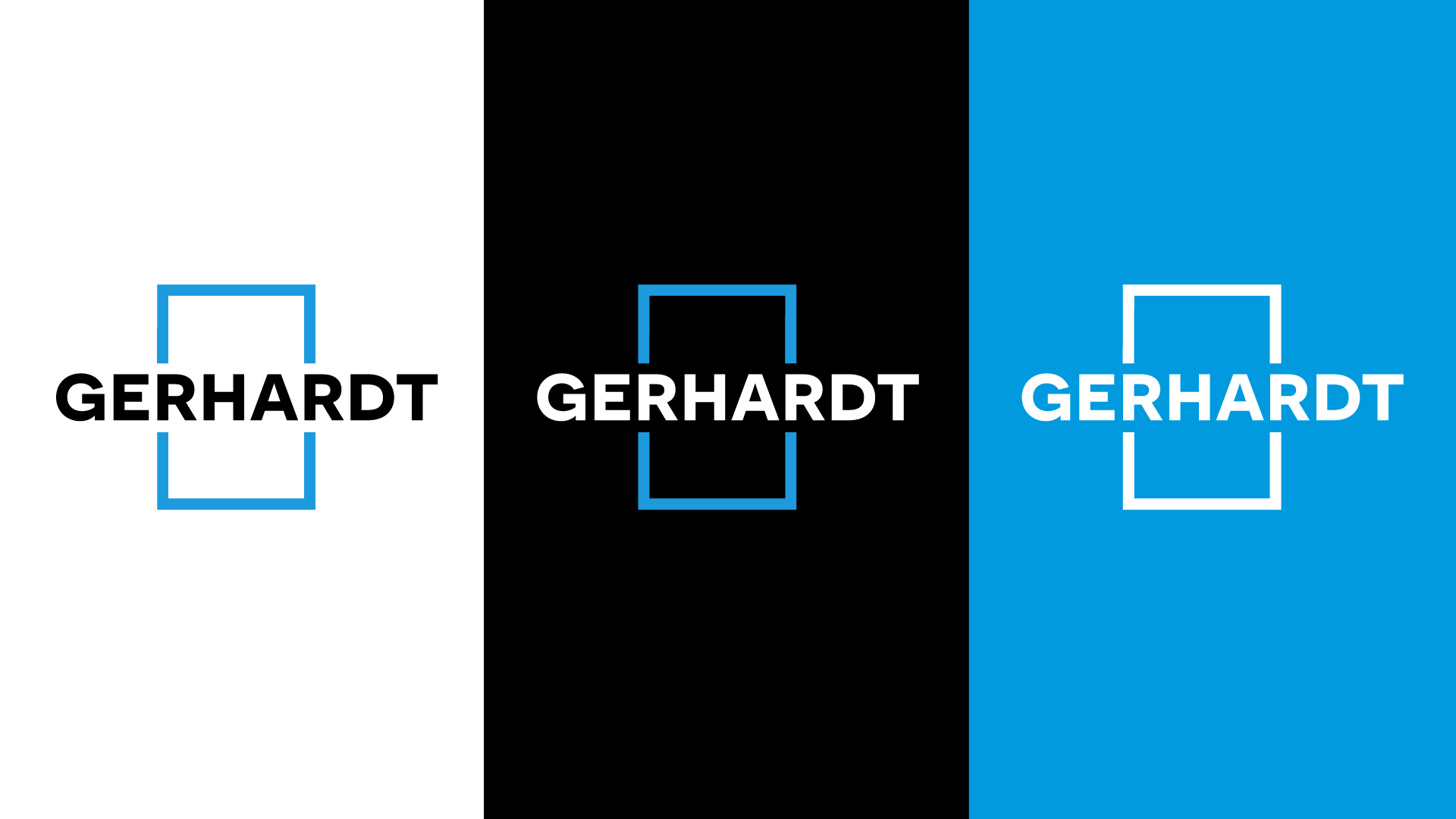
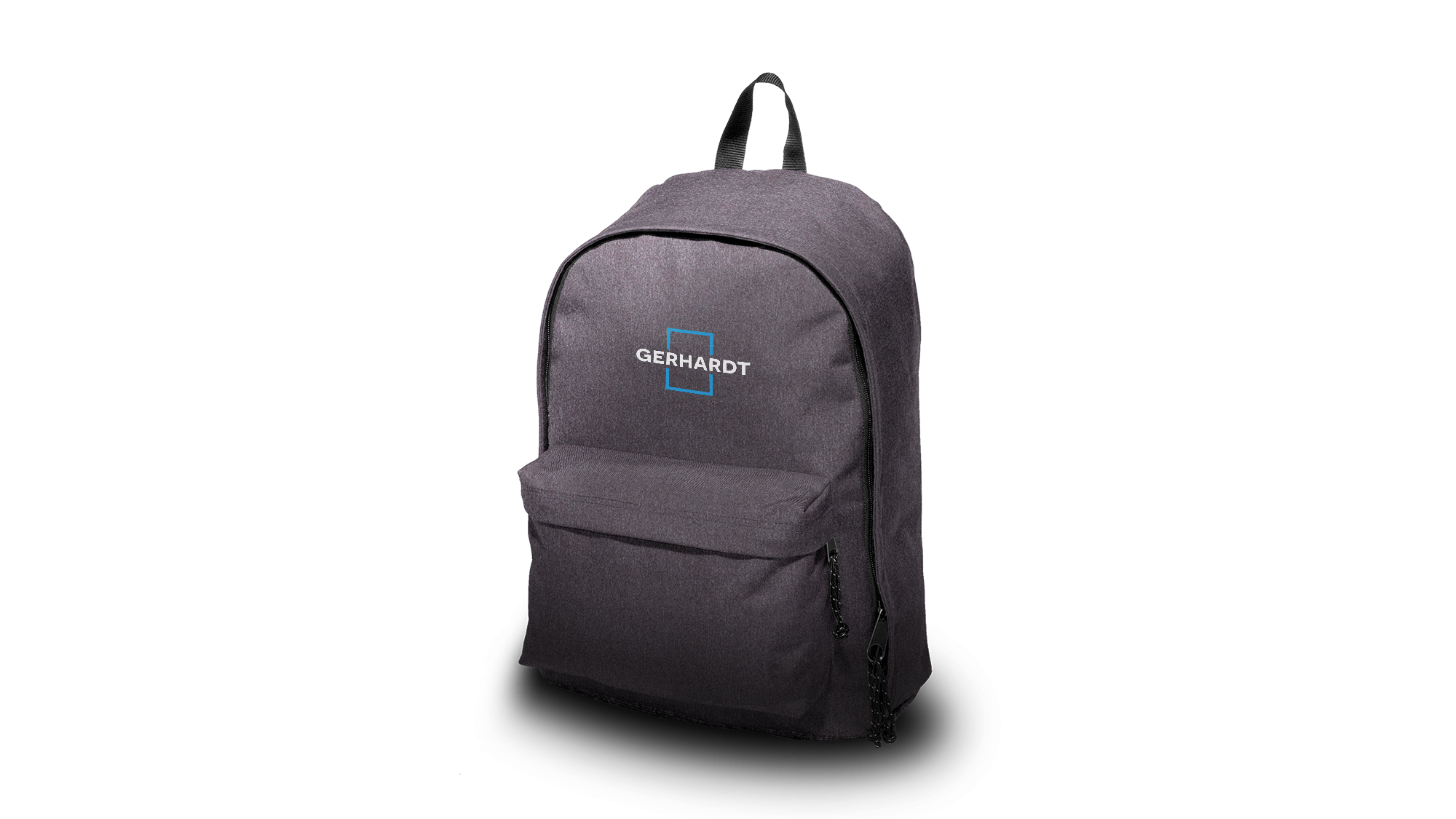
Gerhardt
In family businesses, original graphic brands often carry a strong emotional connection. Helping them understand that redesigning their visual identity strengthens their values and trajectory is part of the journey we embark on starting from the diagnosis of their visual communication.
recorrido
Initially, we focused on the visual diagnosis of the brand and its communication. This allowed us to confirm with the company which historical elements we would rescue in the redesign of the new image. With the honesty and commitment of the family as one of its core values, the new brand takes ownership of its own name and moves away from the category (elevators), facilitating the company's growth into other areas and/or services in the future.
We maintained the use of sky blue and white as priority colors; due to their chromatic history and because it was important for the family to reference the Argentine flag. In the same spirit, it was natural to add to the color palette the three colors of the other flag that represents them, the German flag. Thus, the new identity reflects in its chromatic use the promise that has accompanied the company since its origins: German mindset with Argentine heart.

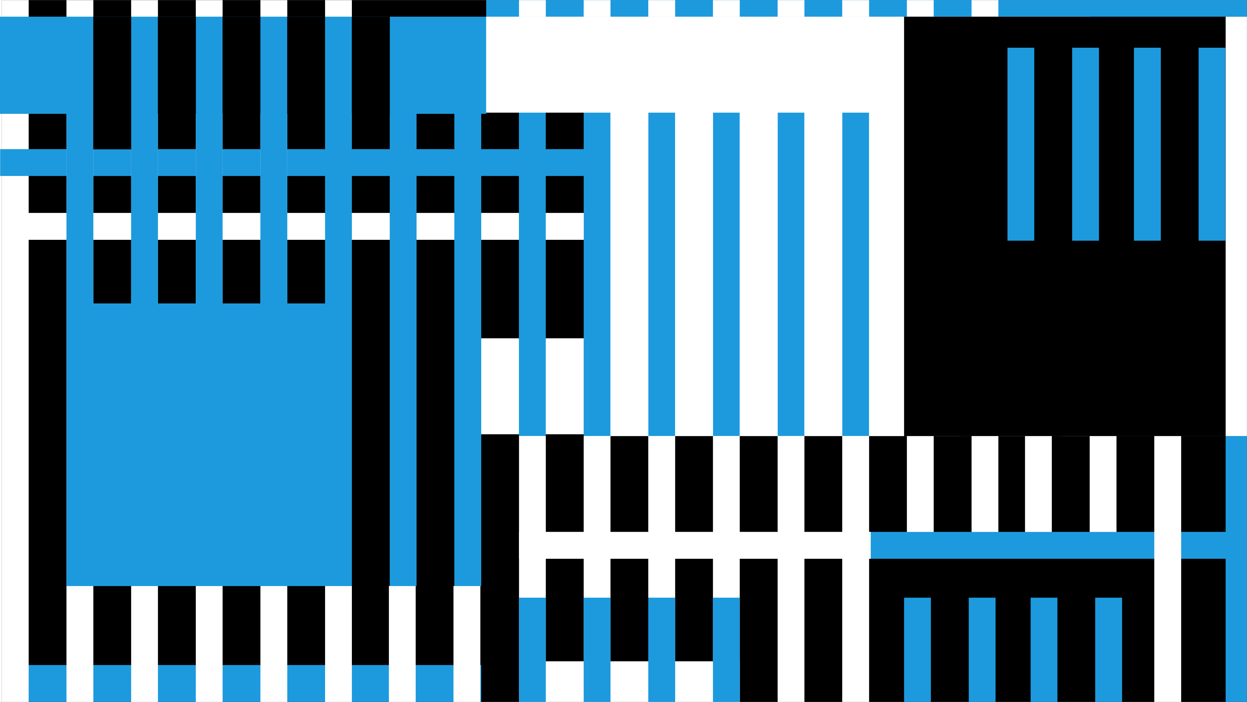
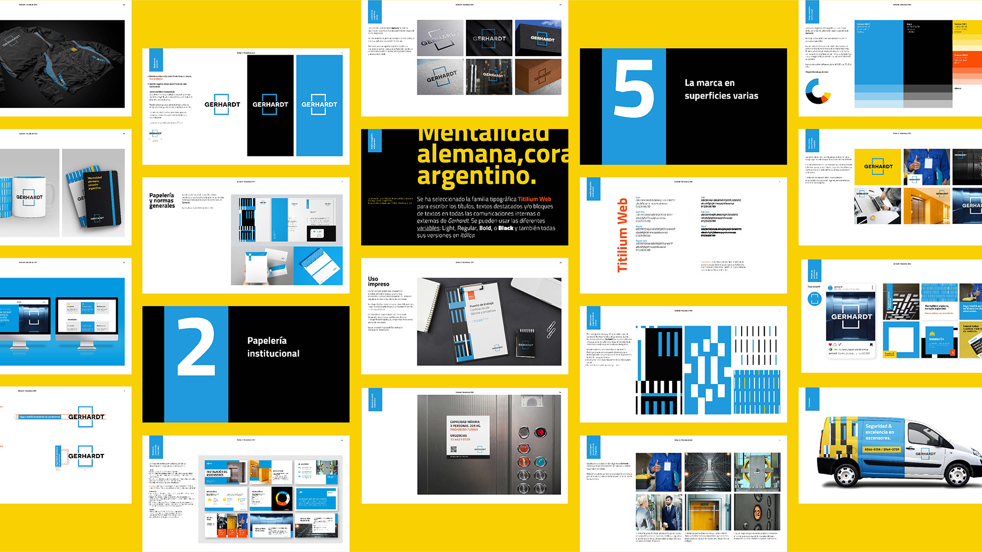
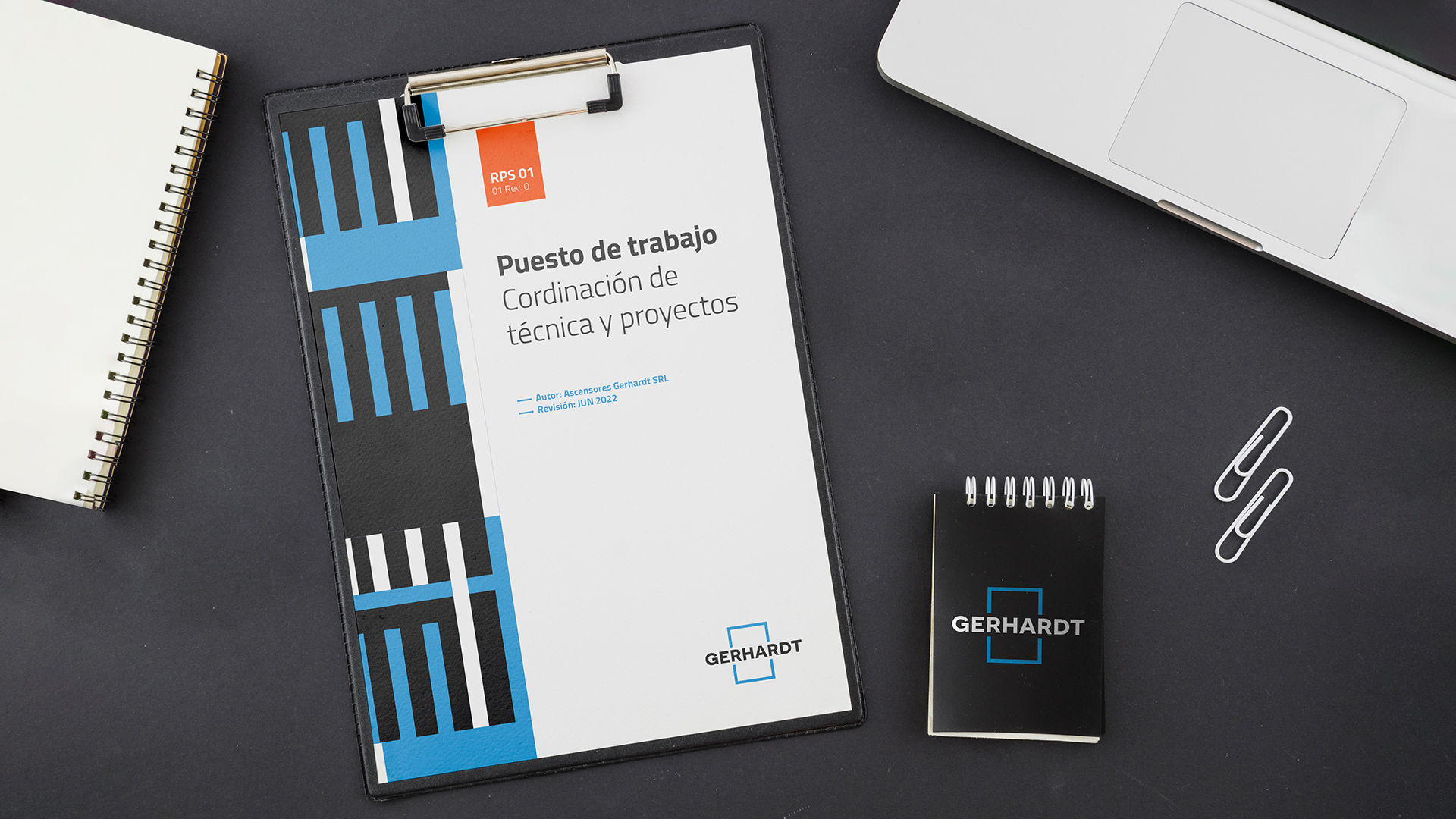
 Composición y gradientes de los colores institucionales de la marca.

In addition to typography and colors, we added to the graphic system a series of patterns that appeal to vertical transport and accompany Gerhardt's communications as a visual complement when photographs cannot be used.