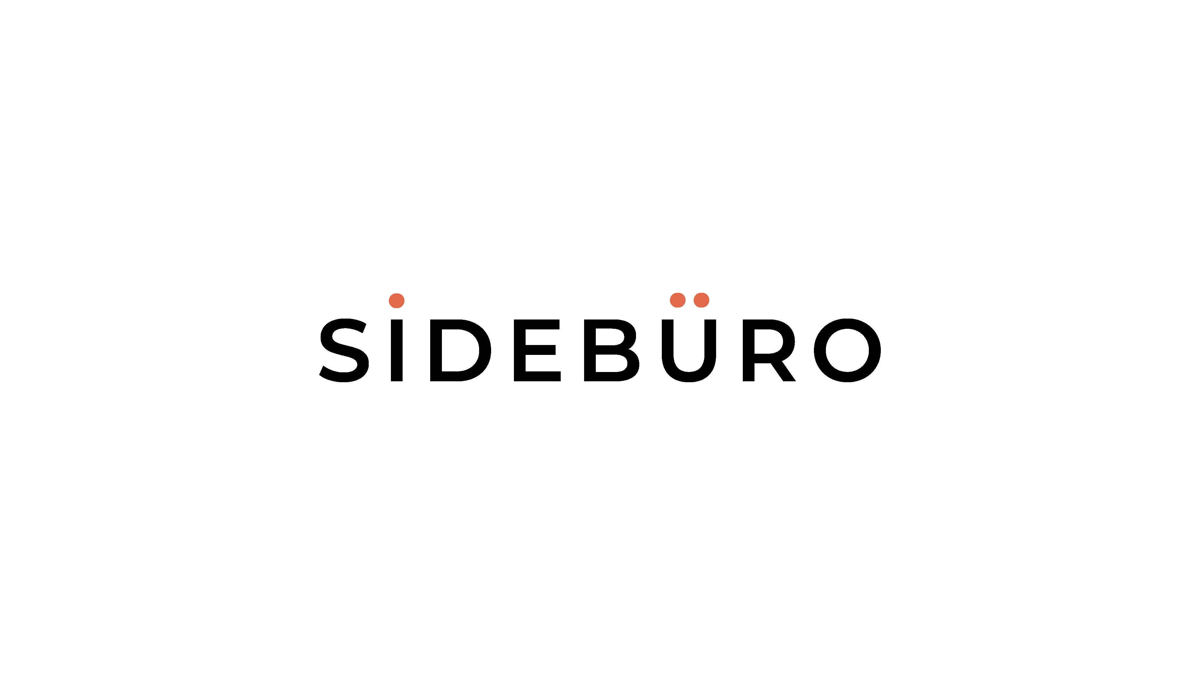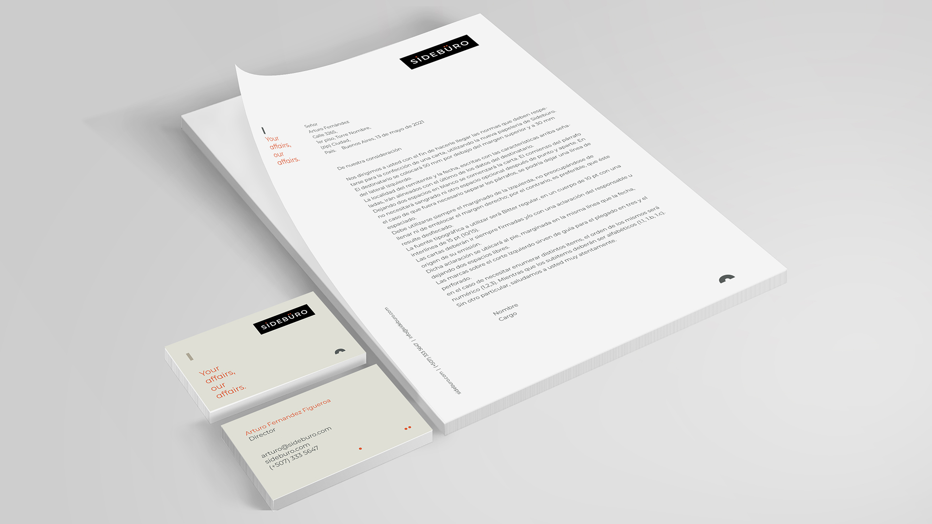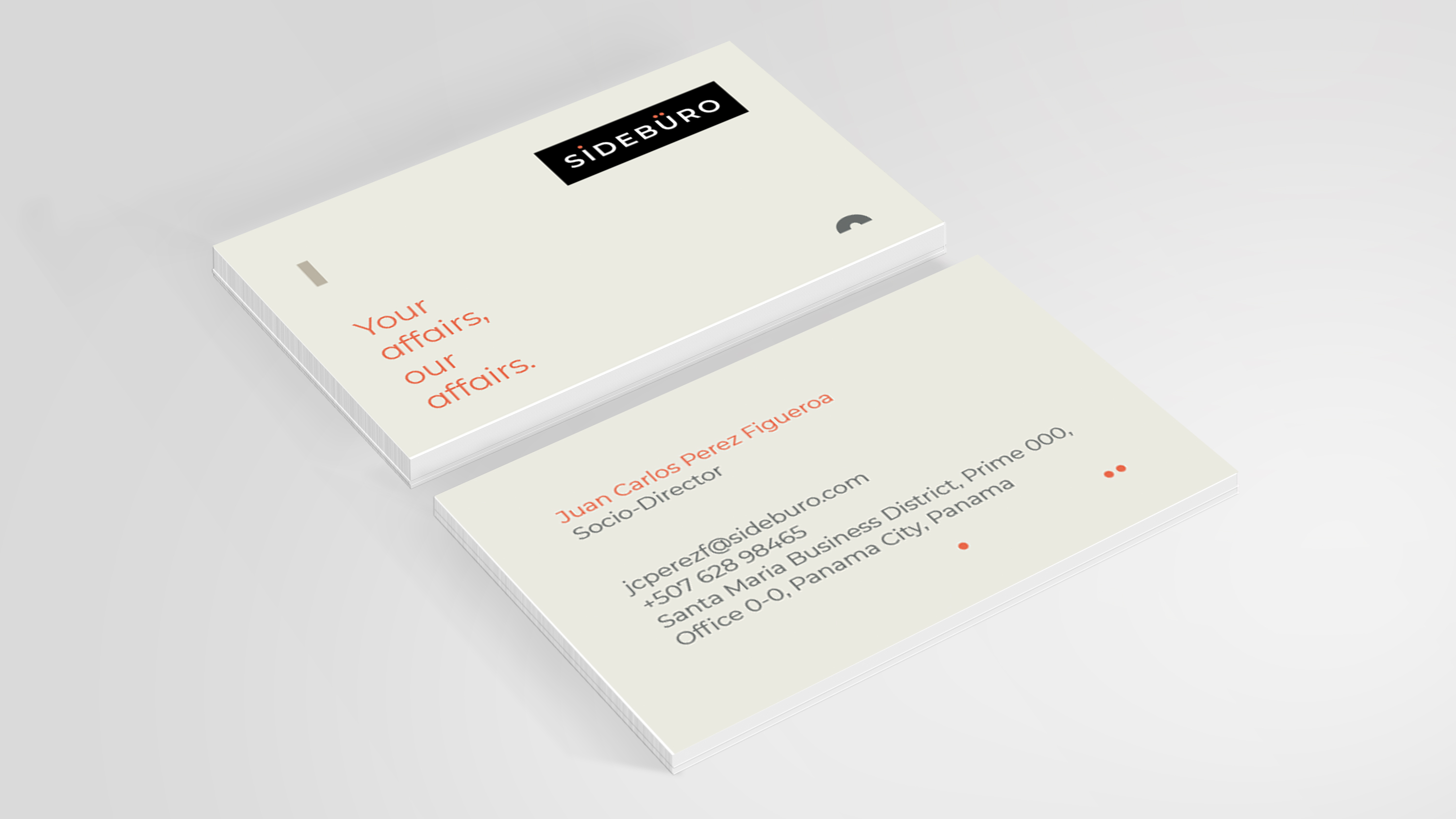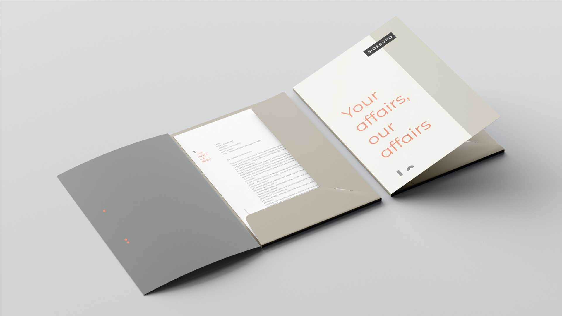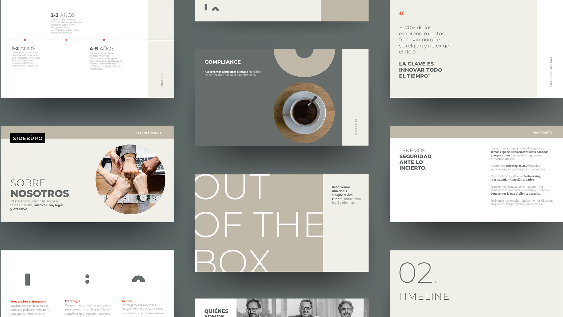
Sidebüro
An elegant and serious Public Affairs company, self-defined as unique, modern and unconventional. The request to build an identity associated with Nordic graphics, transparency, quality, reliability and trust.
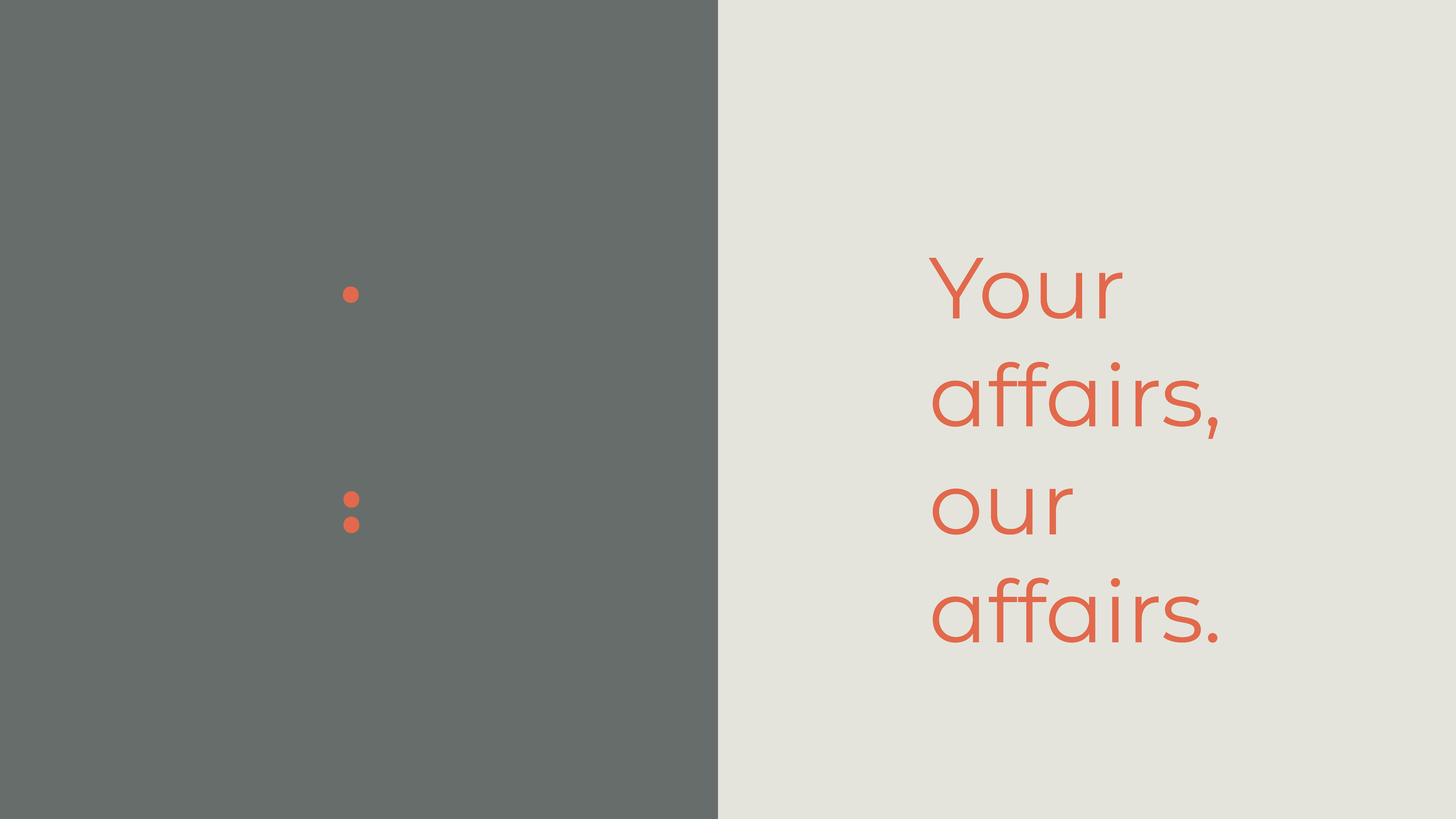
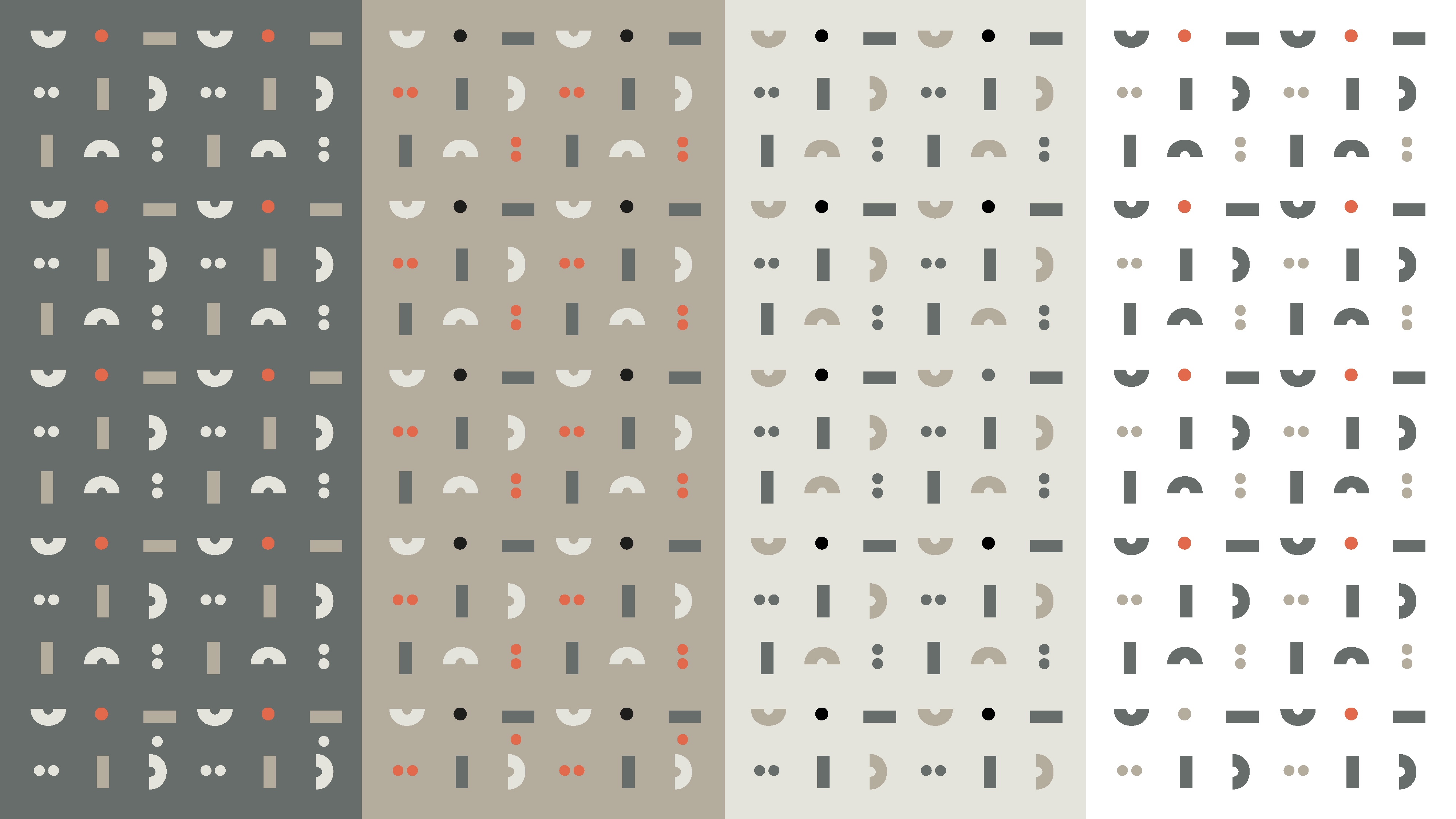
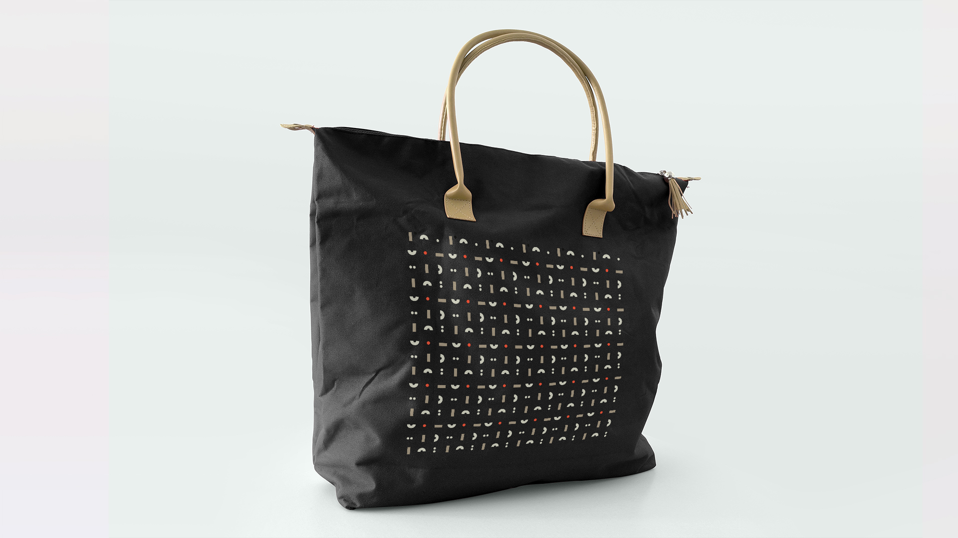
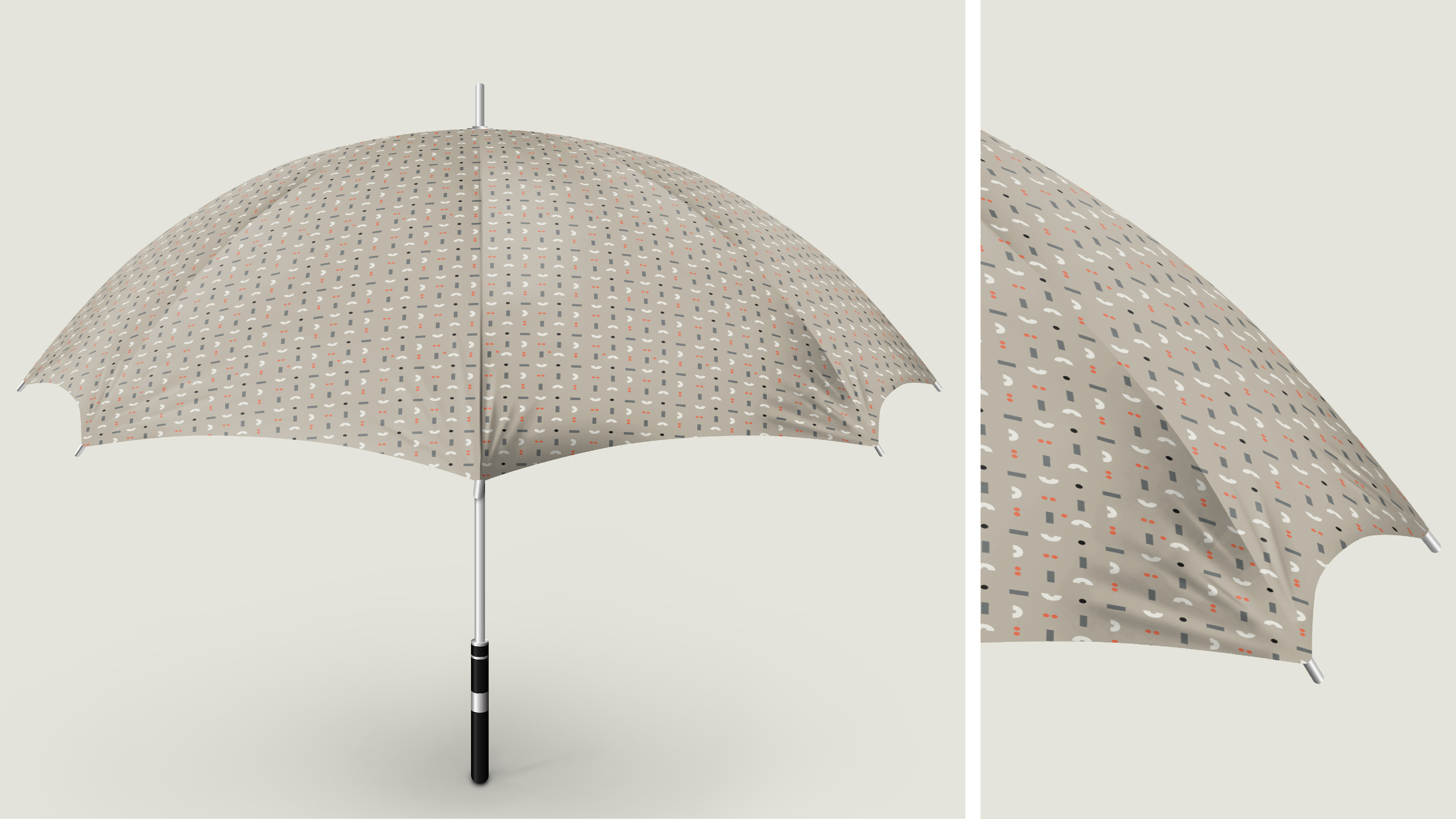
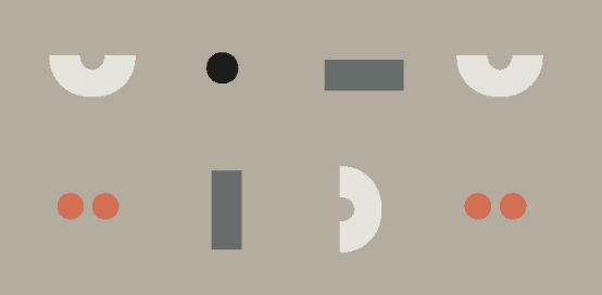
We used a neutral, subtle and refined color range.
We used a neutral, subtle and refined color range.
The Brand aimed at achieving a balance between transparency and trust as well as a strong and solid communication about Sidebüro being a company able to dispel and resolve any doubts. An image flexible enough to grow and spread to other public affairs business units.
A logo that is entirely in blocked letters and incorporates the playful pun on the three dots/individuals. It is about the individual and group dynamics. A formal outline of the business argument: «Your affair, our affair».