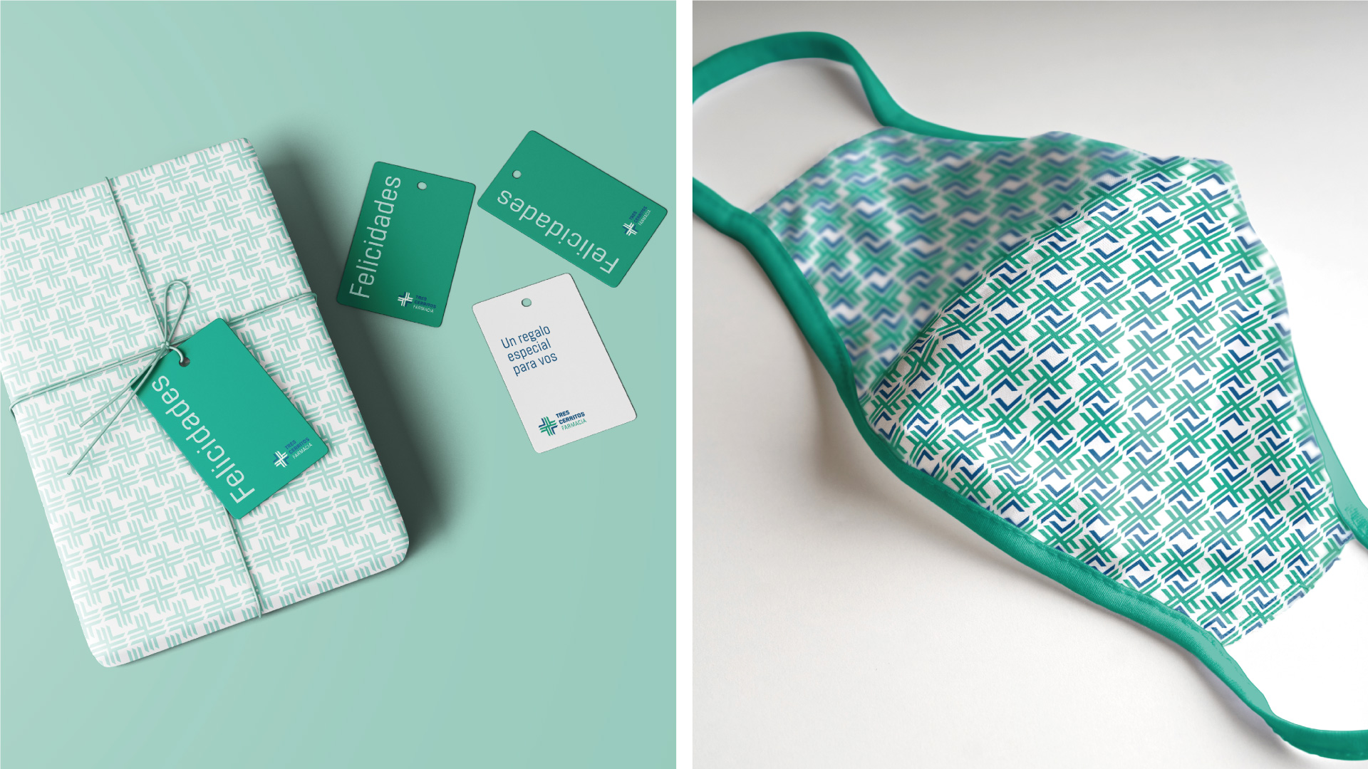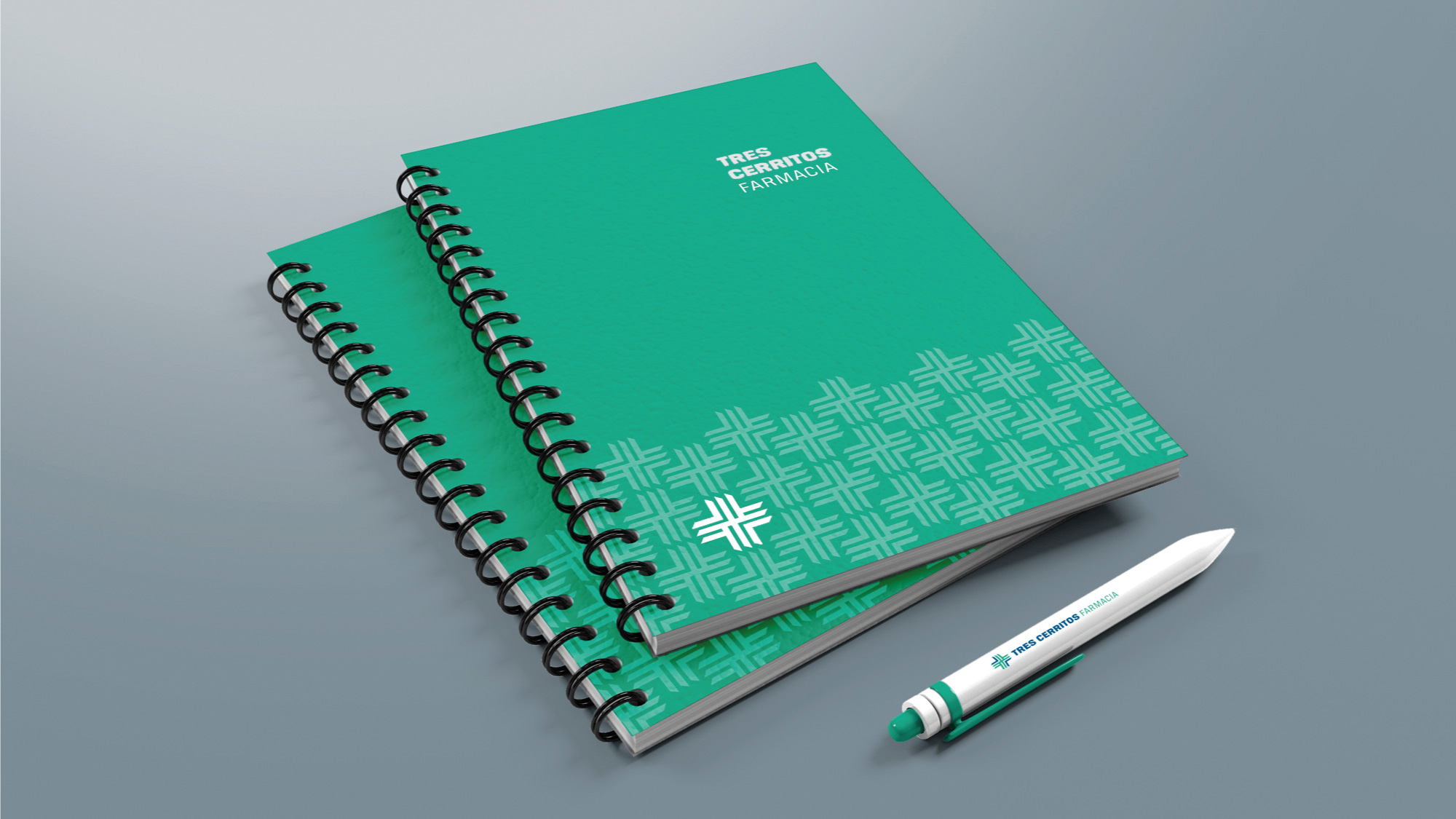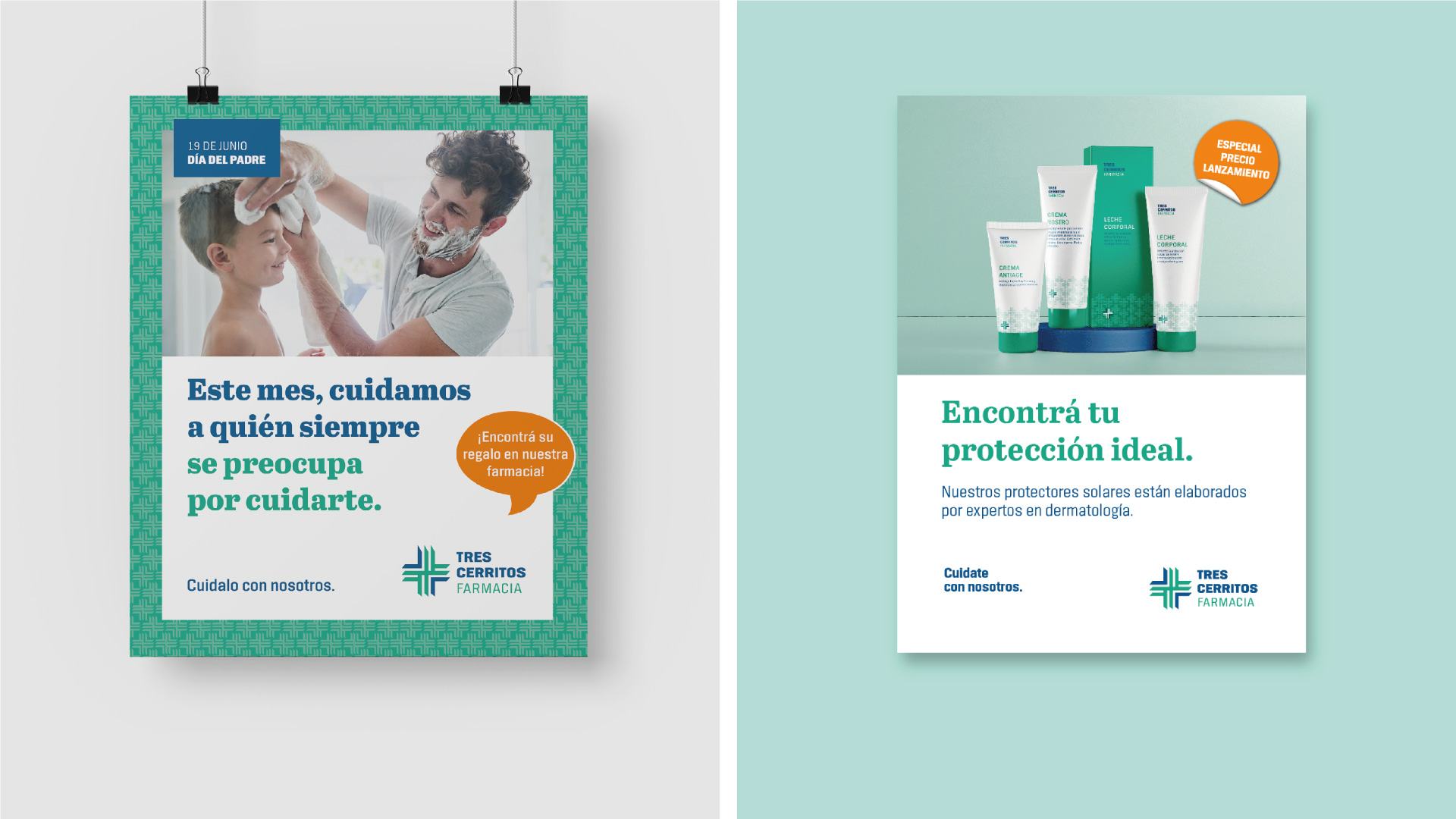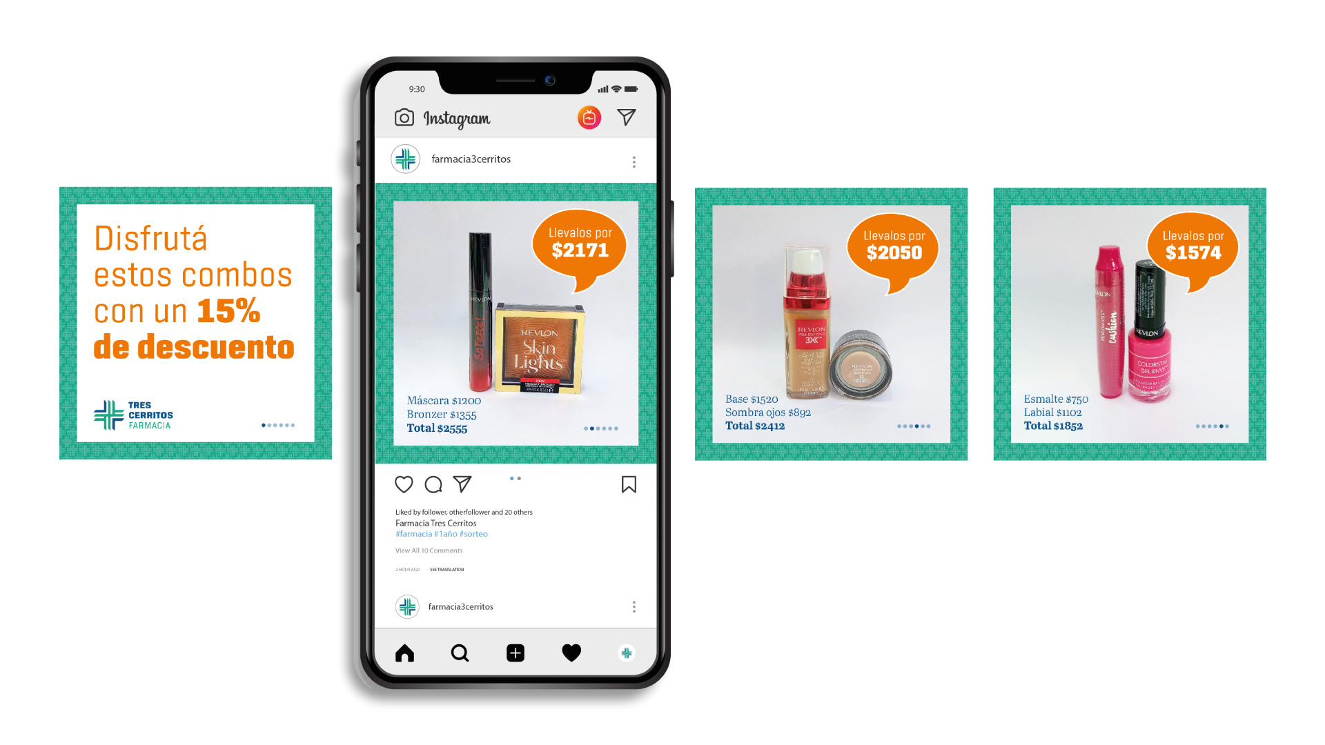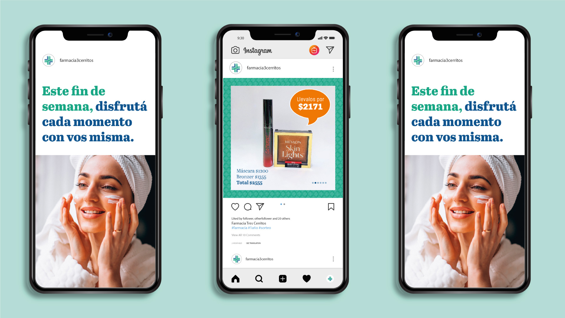
Farmacia Tres Cerritos
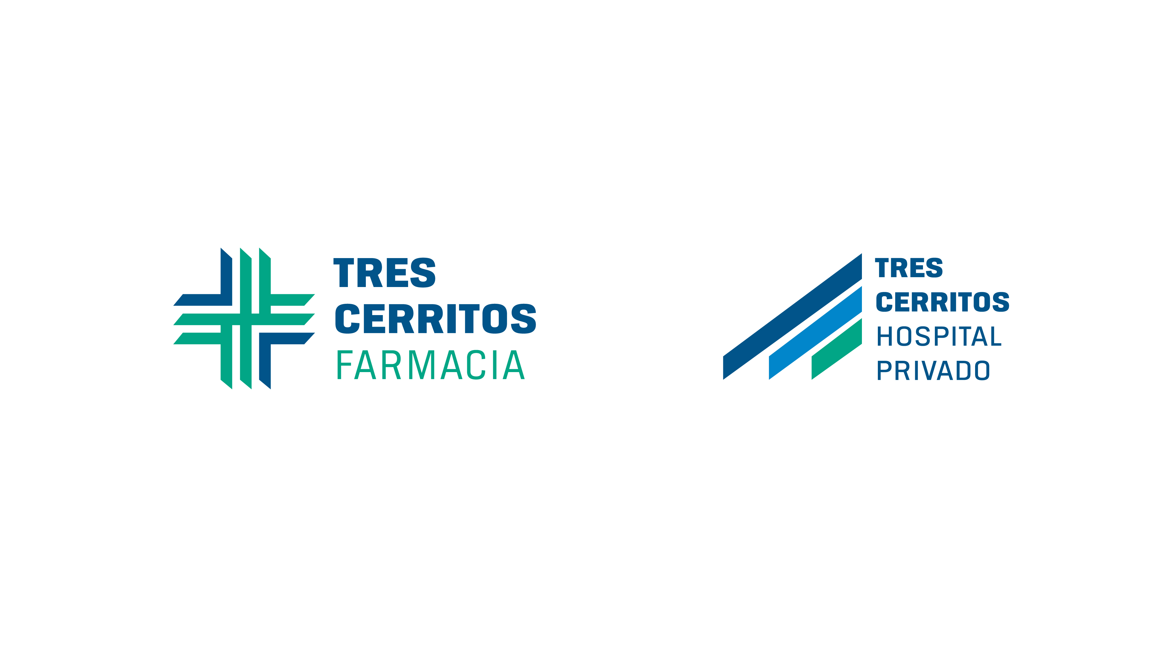
A Private Hospital engages in the retail business leading to a brand with graphic elements defined even before it was born. By retaking a previous project, a new identity develops. It is closely related to the original, but with its own characteristics and personality. It’s the same thing, but different.