Typography
Our passion to see the unseen originates in the study of typography.
We met at the UBA while doing a specialization degree in Typography. Somehow, during classes, we developed a fascination for drawing font lines, form and counterforms that currently lead our projects.
FontAnita and Sistype are thesis projects that aim at spreading our knowledge on typography to other disciplines.
 
A typography designed by Sole Fontana, selected for the Biennial of Latin-American Typography, Latin Types 2018.
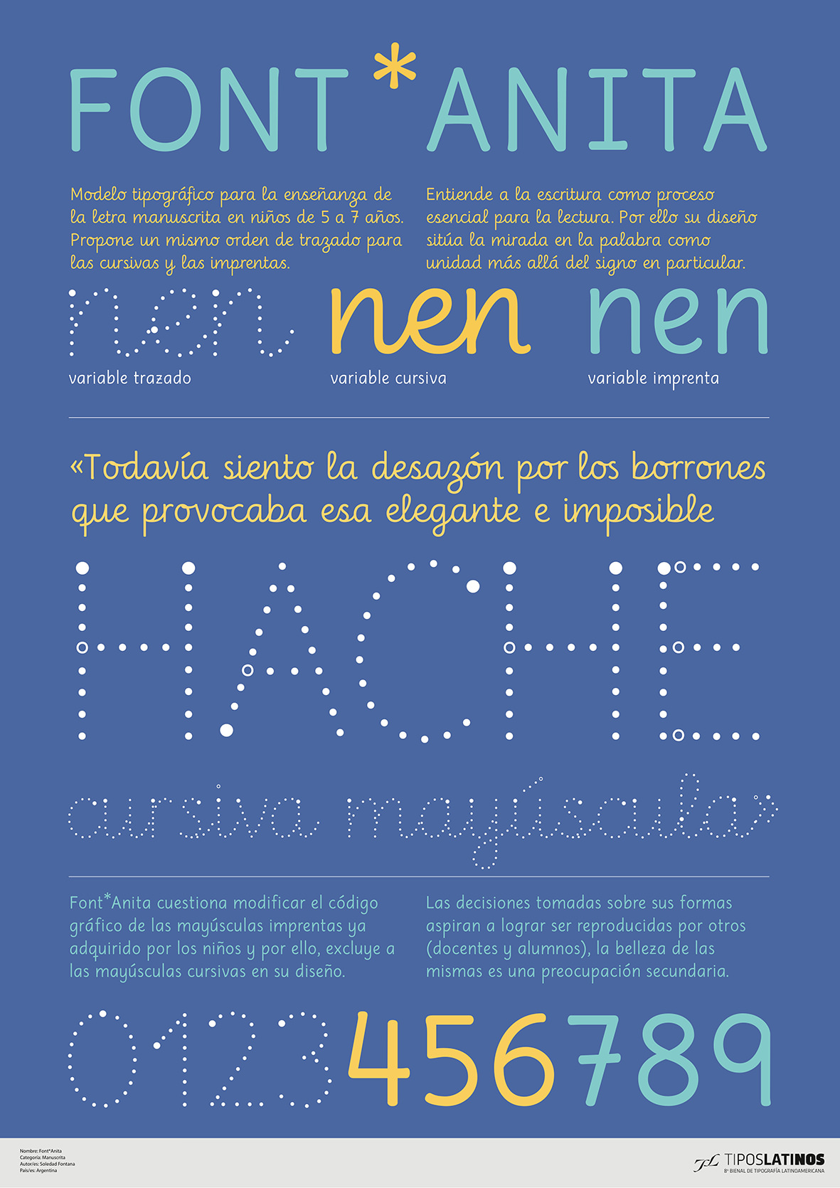
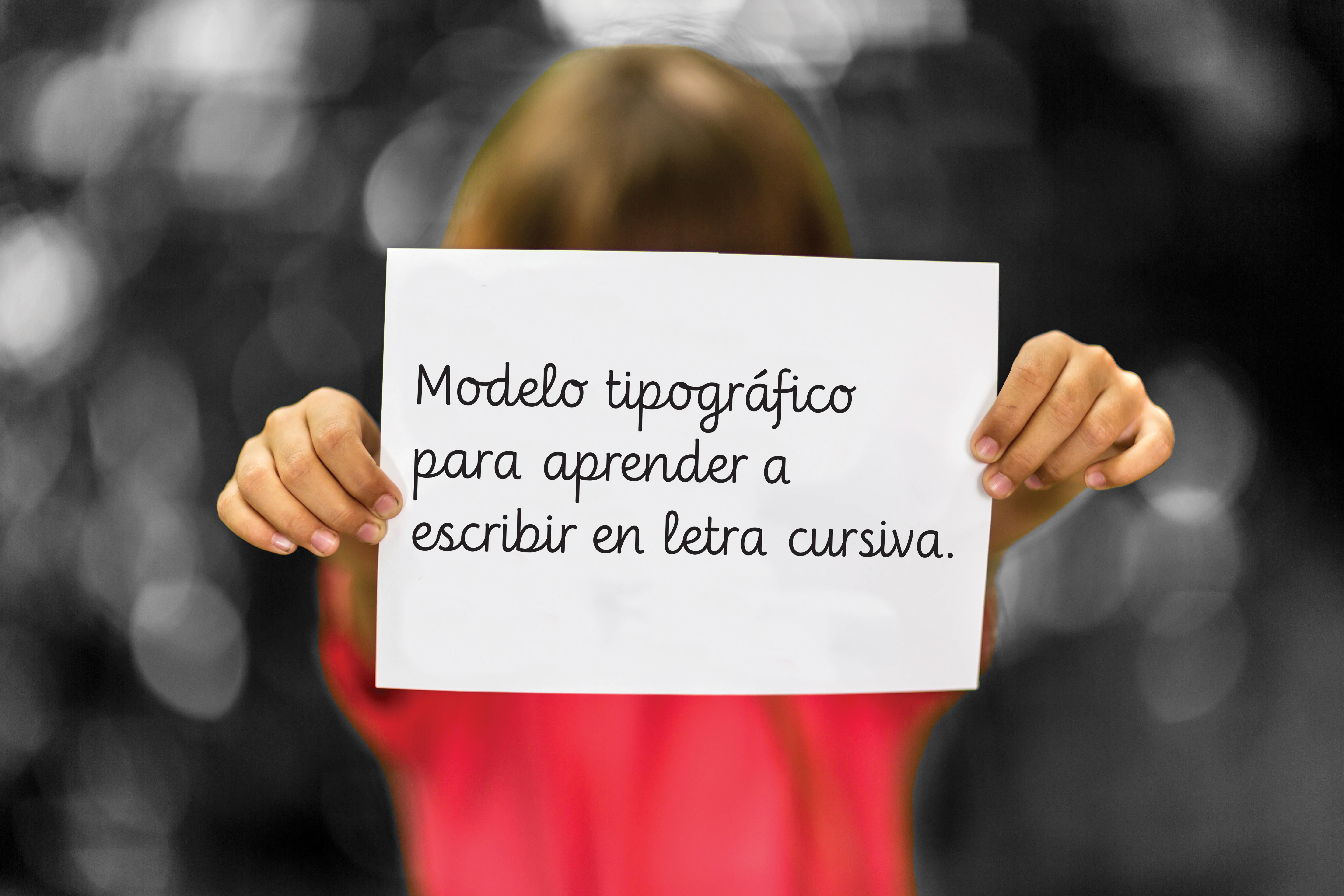
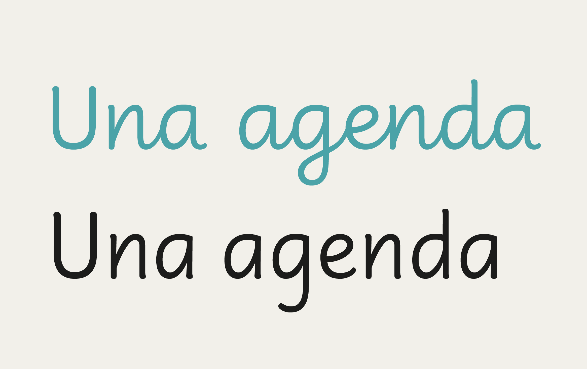
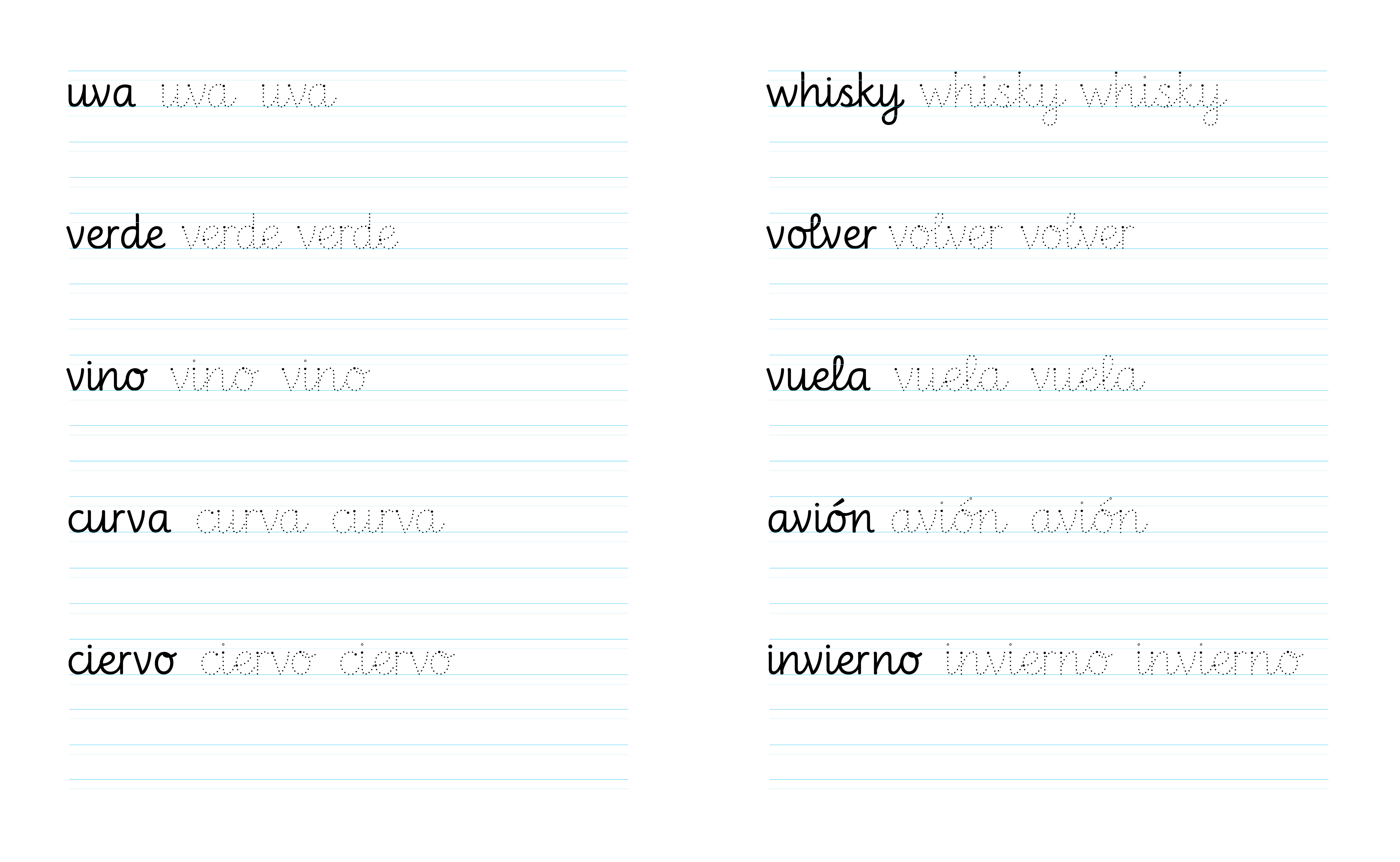
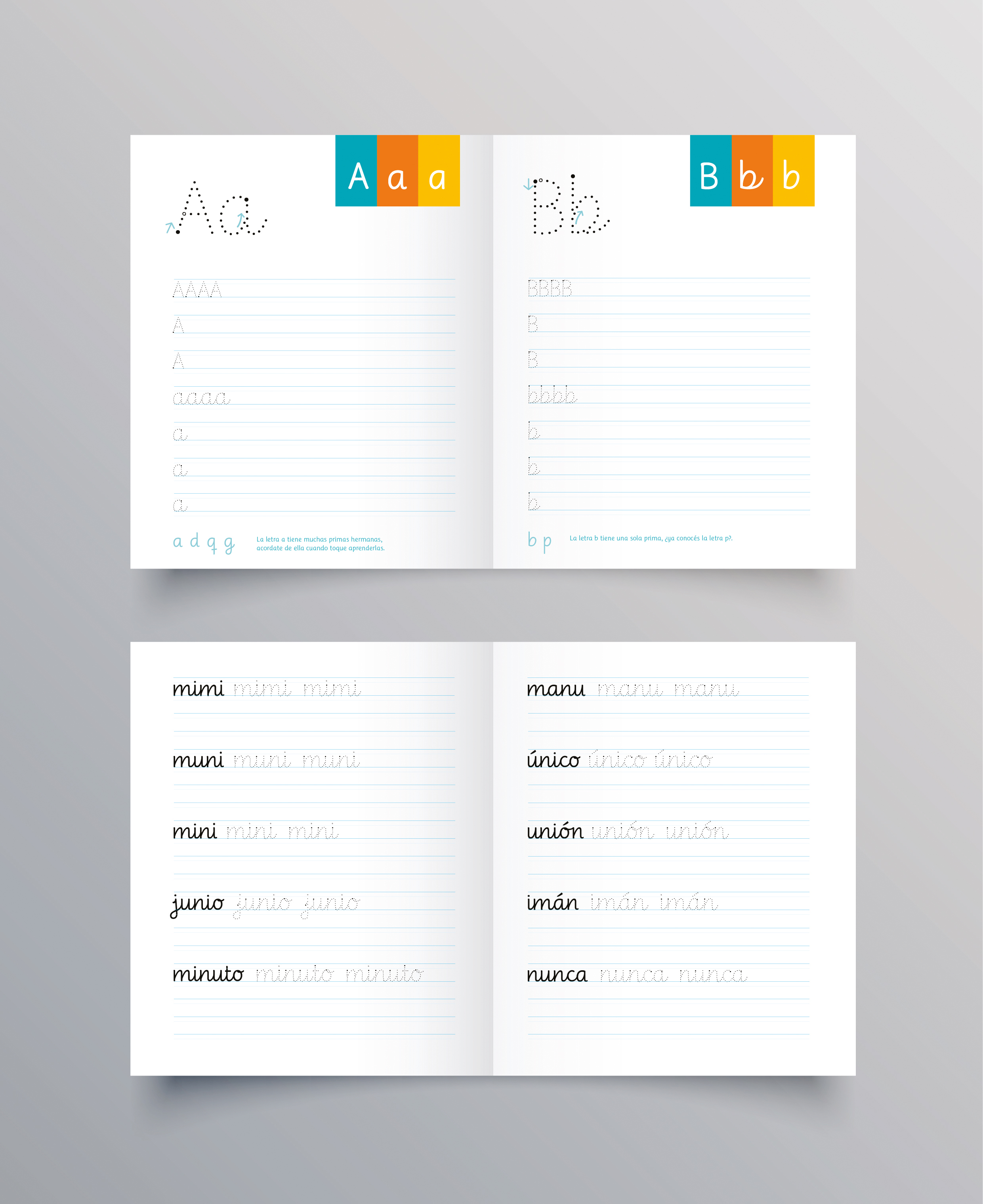
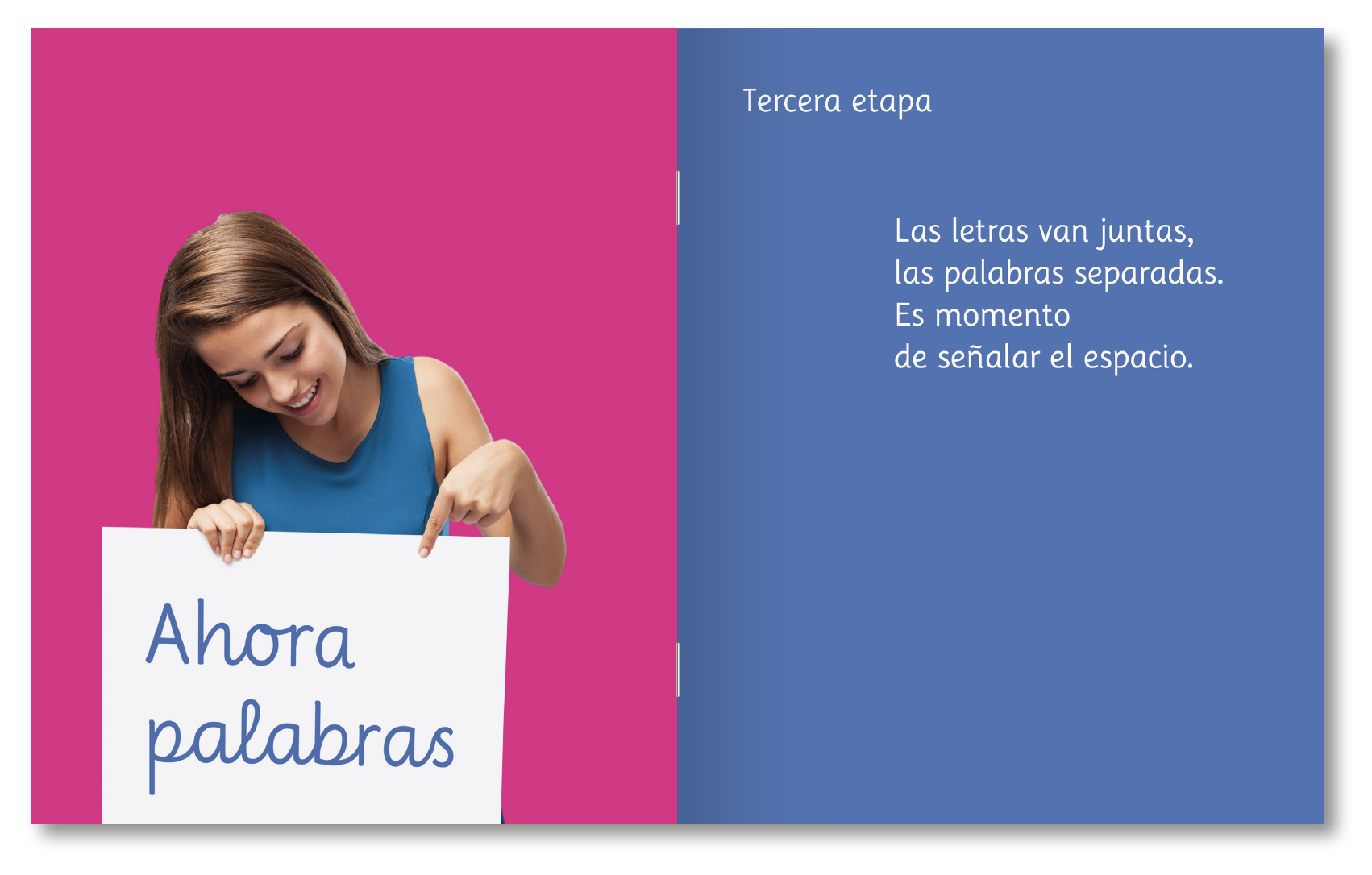
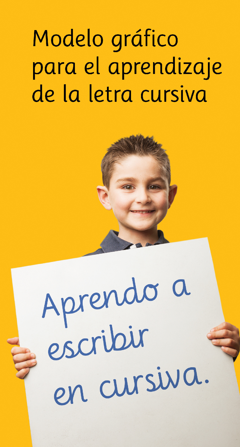
It was conceived as a Font model for teaching handwriting to 5 to 7-year-old kids. This typography proposes the same trace arrangement for cursive and printed letters.
Font*Anita explores the difficulties children have when they start reading and writing, especially using cursive letters.
It develops a graphic model that makes writing easier to teach and learn by simplifying the individual graph symbol and reducing the traditional model from four to three signs. It includes a reading variant, formally related to the cursive font, to follow the joint and indivisible process of learning to read and write.

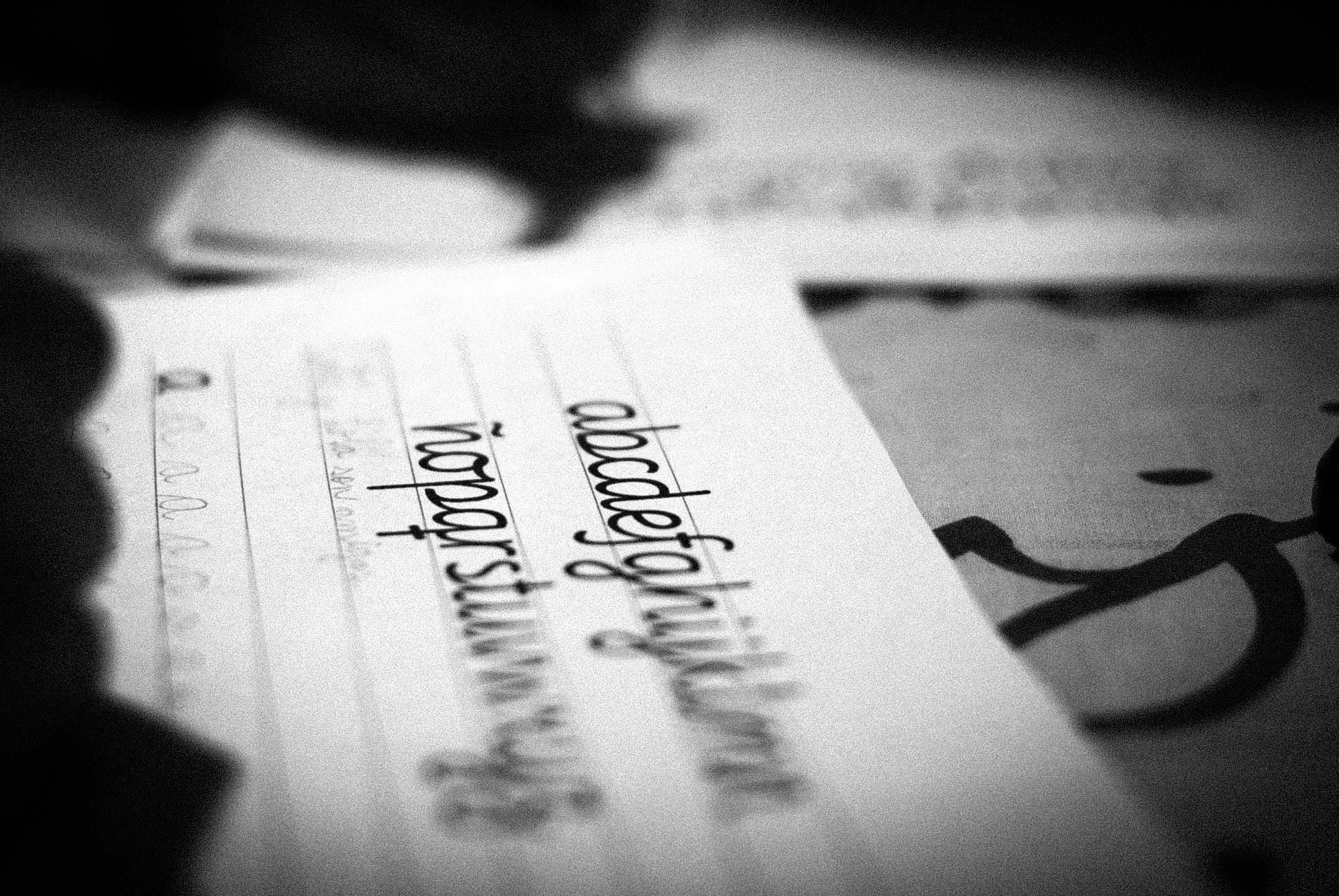
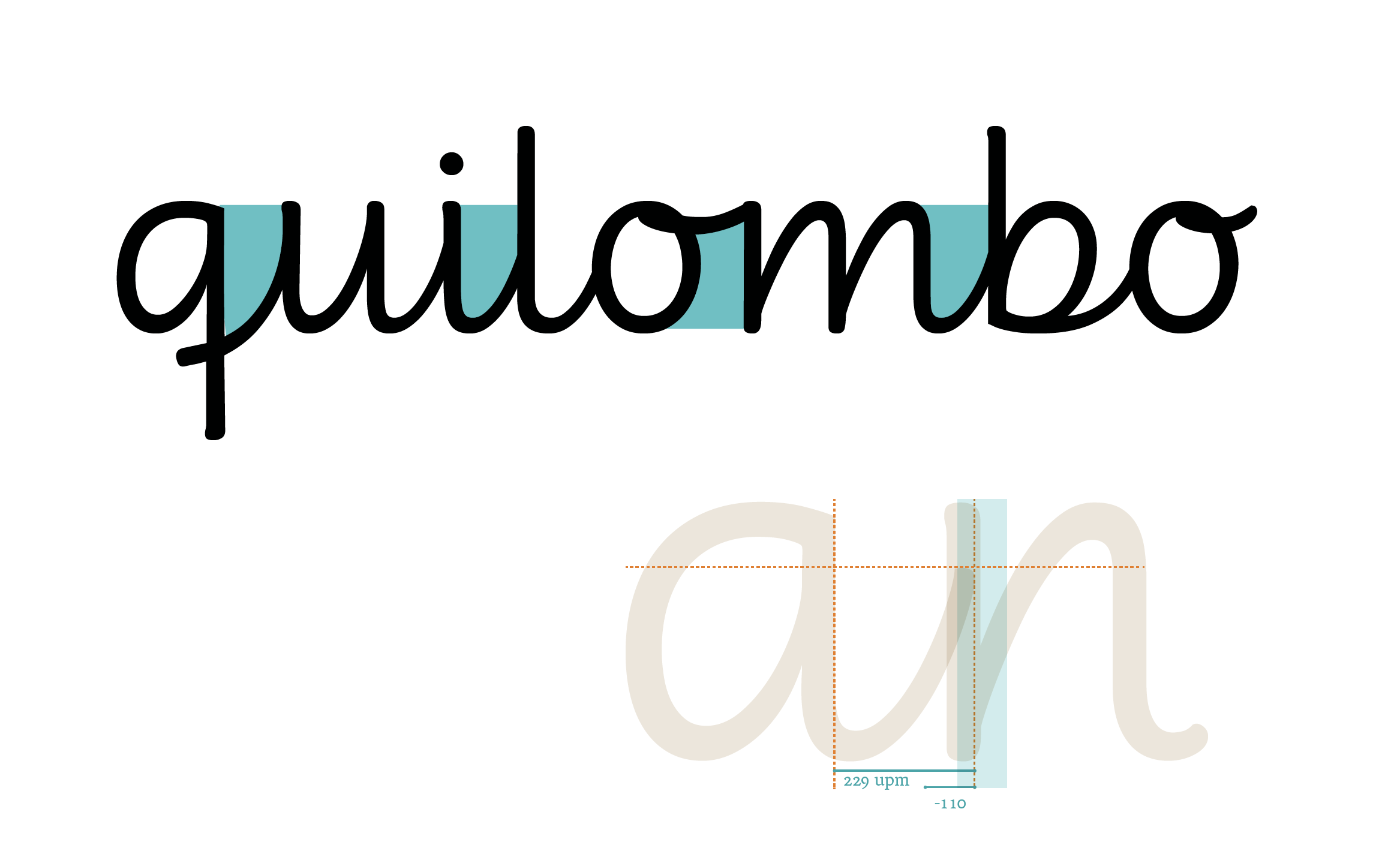
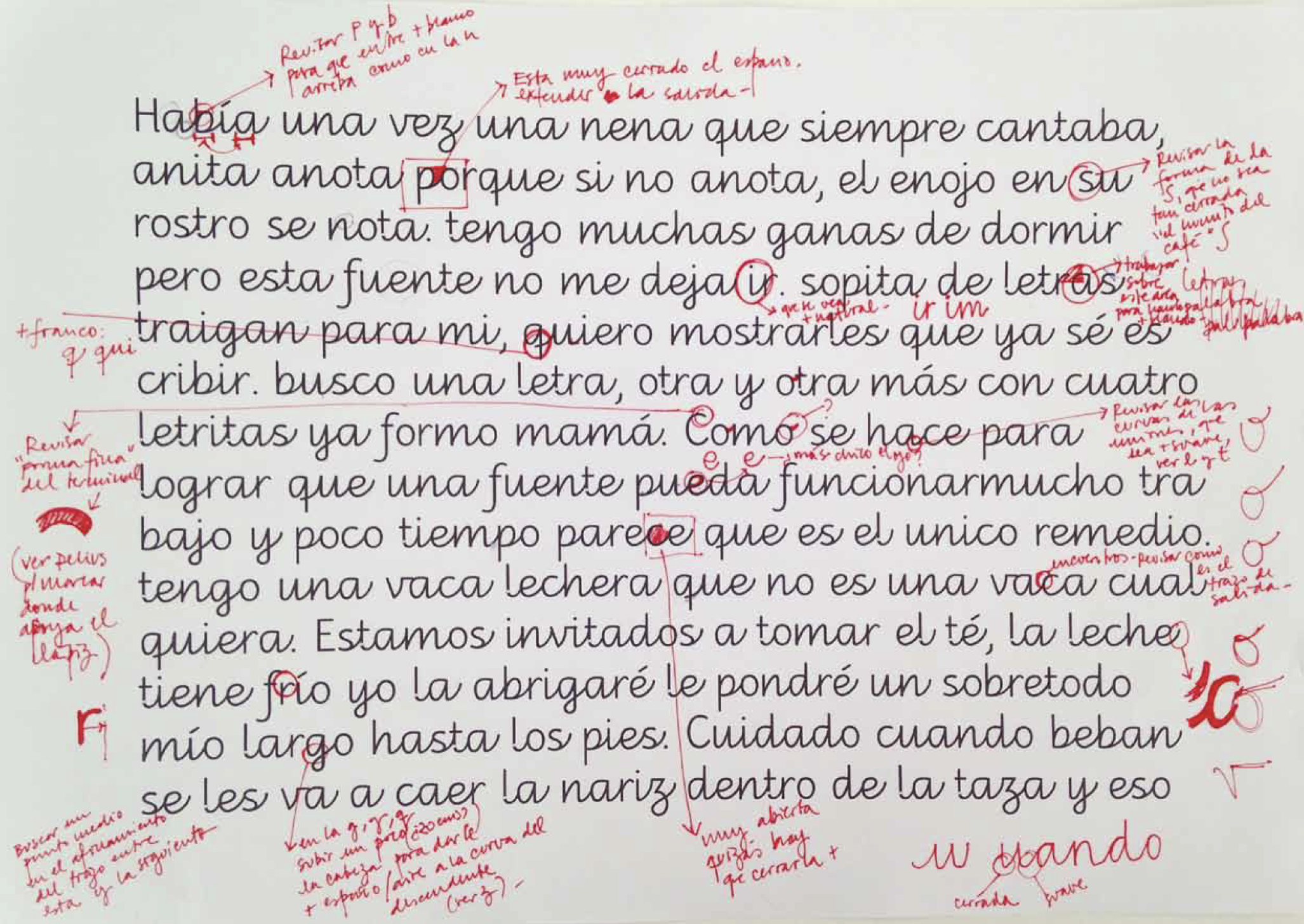
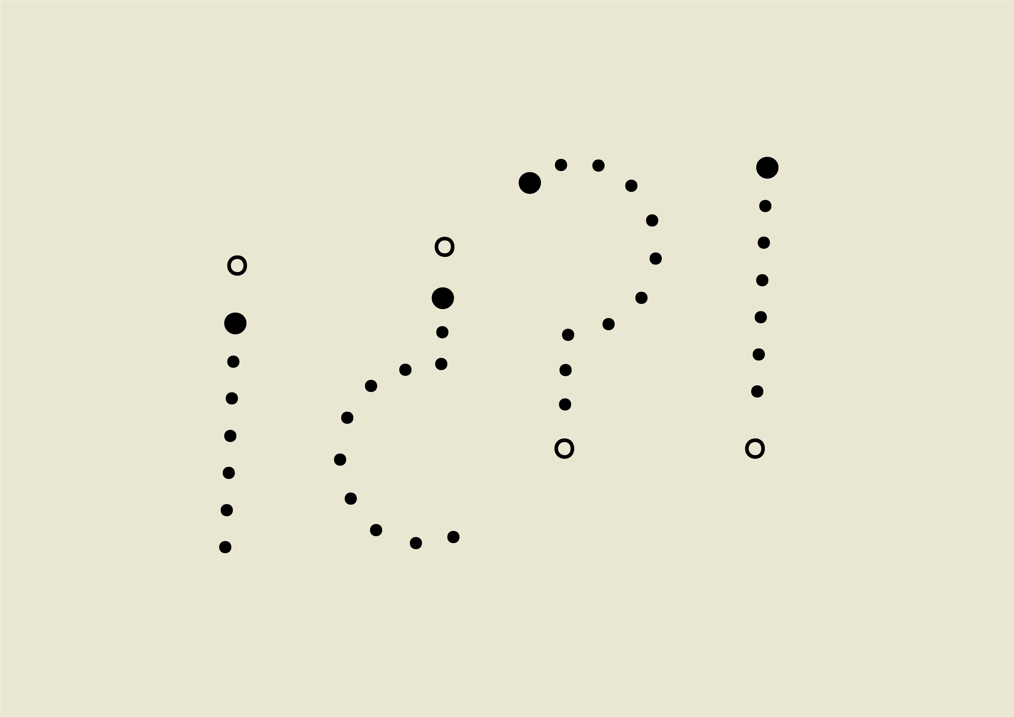
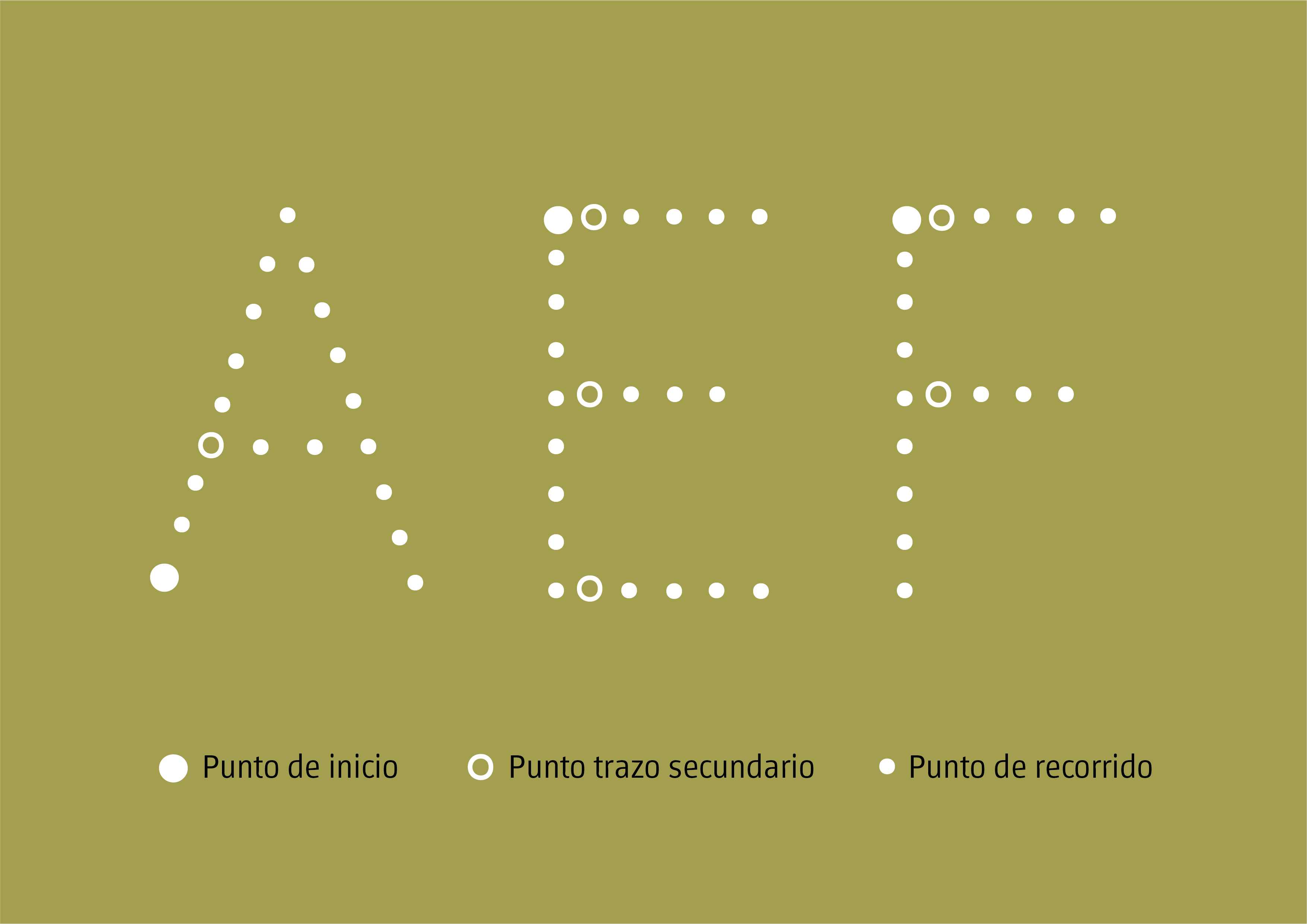
Notas y ajustes en el proceso de diseño de la fuente.

SISTYPE is a typography project carried out by Forencia Sisti Michellod as part of a Master's degree in Typography at the University of Buenos Aires (UBA), Argentina. Selected for the Biennial of Latin-American Typography, Latin Types 2016.

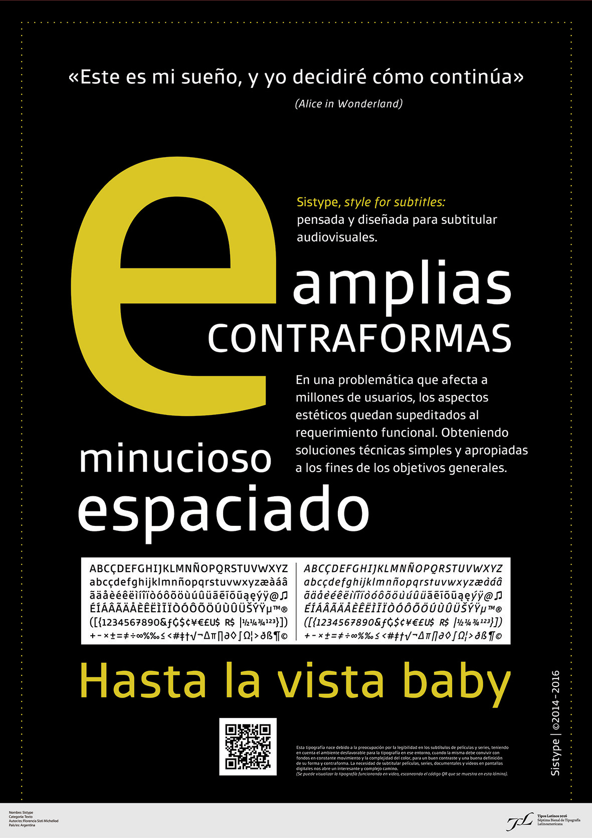
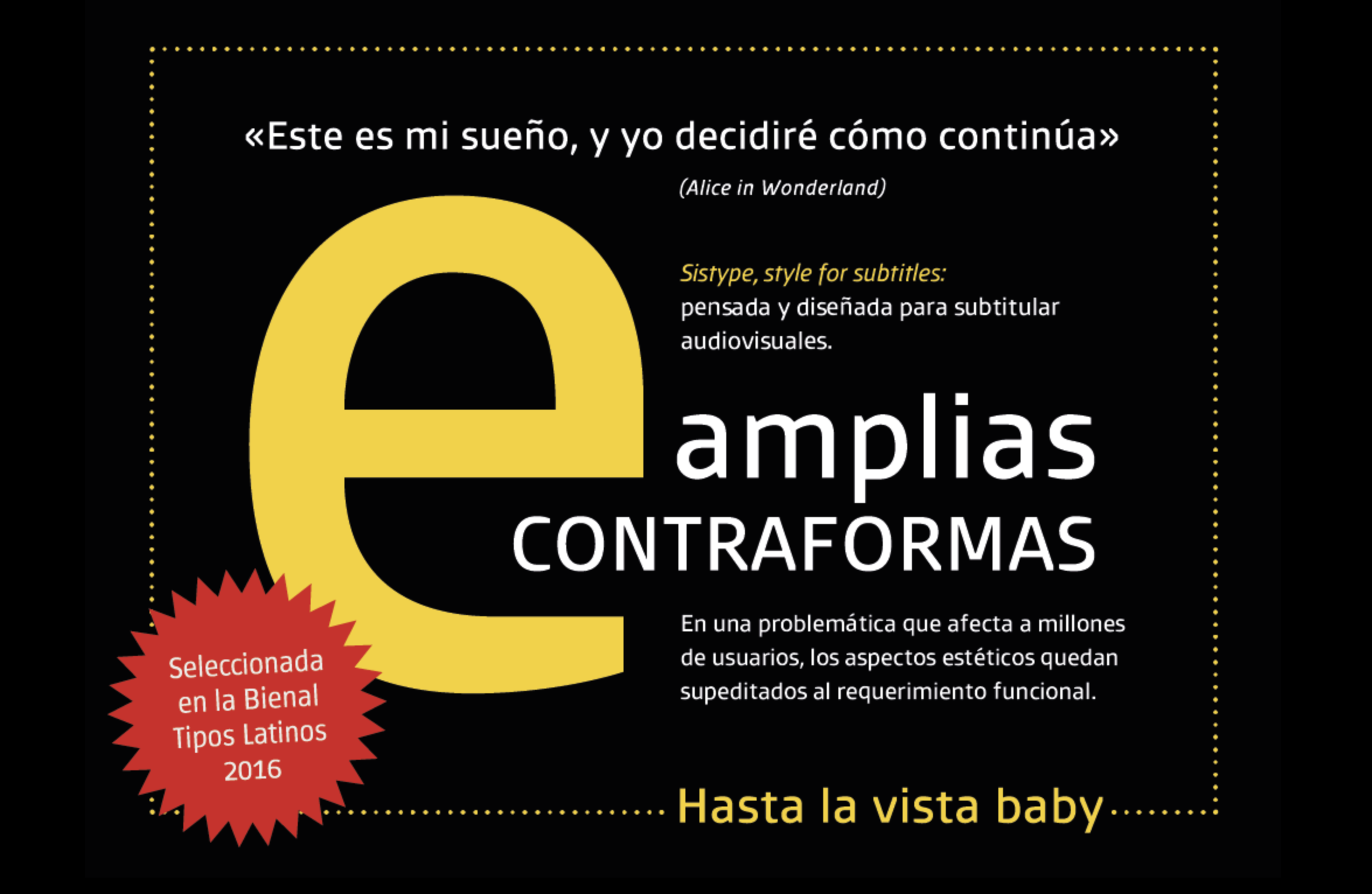
Sistype was conceived with the concern about readability of film and series subtitles in mind.
SISTYPE typography was planned and designed to create subtitles and optimize the readability of audiovisual pieces, thus contributing to improve and ease the subtitling process.
SISTYPE family is a sans serif humanist font, with classic structure, open aperture and medium contrast between traces. It is made up of three design variables: regular, bold and italics. Each variable with a full basic character set.
Spacing was one of the most challenging and complex aspects of this project. It is more generous than usual for a printed text font, due to the complex counterforms generated by background moving images. It is worth pointing out that this spacing is used only for video. It is recommended to use a negative tracking no smaller than 25 points for text.

Para el subtitulado se recomienda ver el siguiente video tutorial de SISTYPE